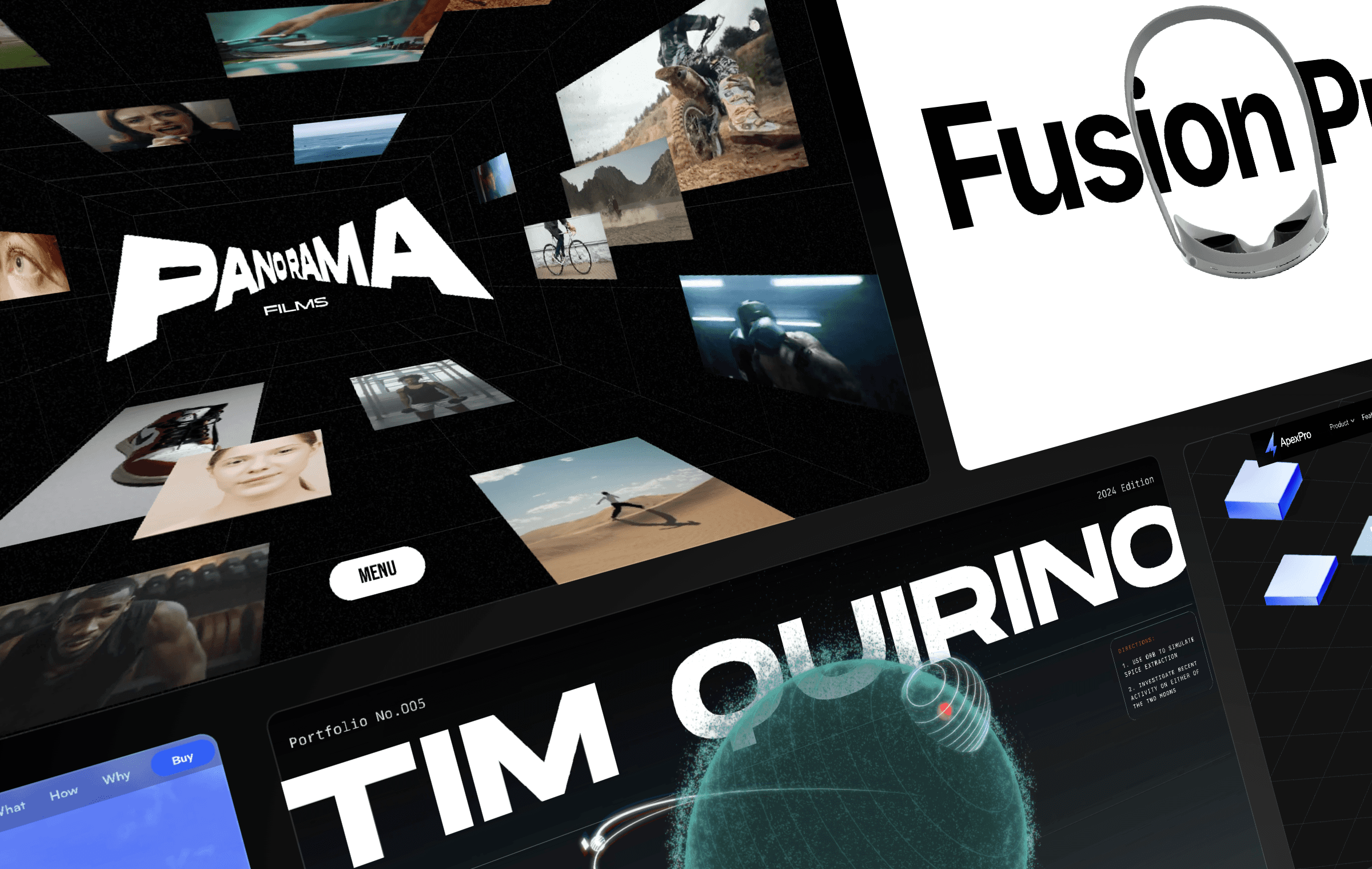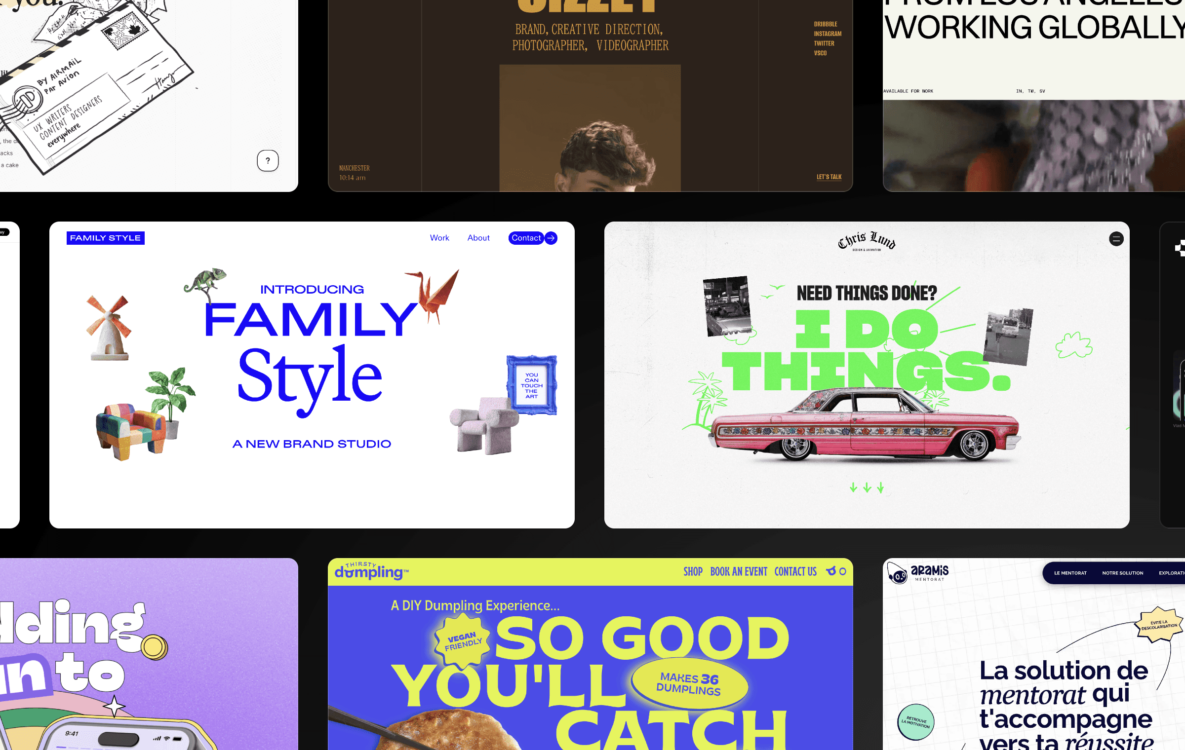


I used Framer to create playful and fun 404 pages that can delight and engage users. In this article, I will share some of my favorite no-code variations that you can remix and customize to suit your needs.
Playful No-Code Variations for Framer Sites
Who says 404 pages have to be boring? I've created a few playful no-code variations that you can use for your Framer sites. With Framer, you can easily remix these projects and customize them to suit your needs. These variations are not only fun and engaging but also help keep users on your site and guide them toward other areas of your website.
Using GIFs in Framer
I love that you can easily use GIFs in Framer. You can just drag and drop your GIF onto your canvas like any other static image! In one particular example, I used a lovely animation created by @YUX that I found on GIPHY. The animation added an element of surprise and delight to the 404 page, making the experience much more memorable for users.
Dreamy Animations with the Blur Effect
In another example, I used the fantastic work from Erica Anderson that I found on GIPHY and added a blurred effect to make it look dreamy. The blur also ensured that the animation scaled nicely for larger displays, making it more accessible to a wider audience.
Embedding 3D Typography to My Page
To create glossy letters for another 404 page, I used Spline. I then added the 3D render to my page using the Embed component from the Insert Menu. The result was a visually stunning 404 page that captured the attention of users and kept them engaged.
Using Text Masks
In another example, I used the Text Mask component from Benjamin den Boer. I used a looped GIF as a mask and adjusted its Y position. The result was a unique and eye-catching 404 page that stood out from the crowd. And just like the previous examples, this one was easy to create and customize in Framer.
Creating Gradient Animations with Loop Effects
For yet another 404 page, I created a subtle gradient animation using the Loop Effect. It featured a radial gradient with a Hue blending mode, animated to gradually adjust its scale and blend smoothly with the underlying gradient. This created a visually stunning effect that added depth and dimension to the 404 page.
Creating Your Own 404 Page in Framer
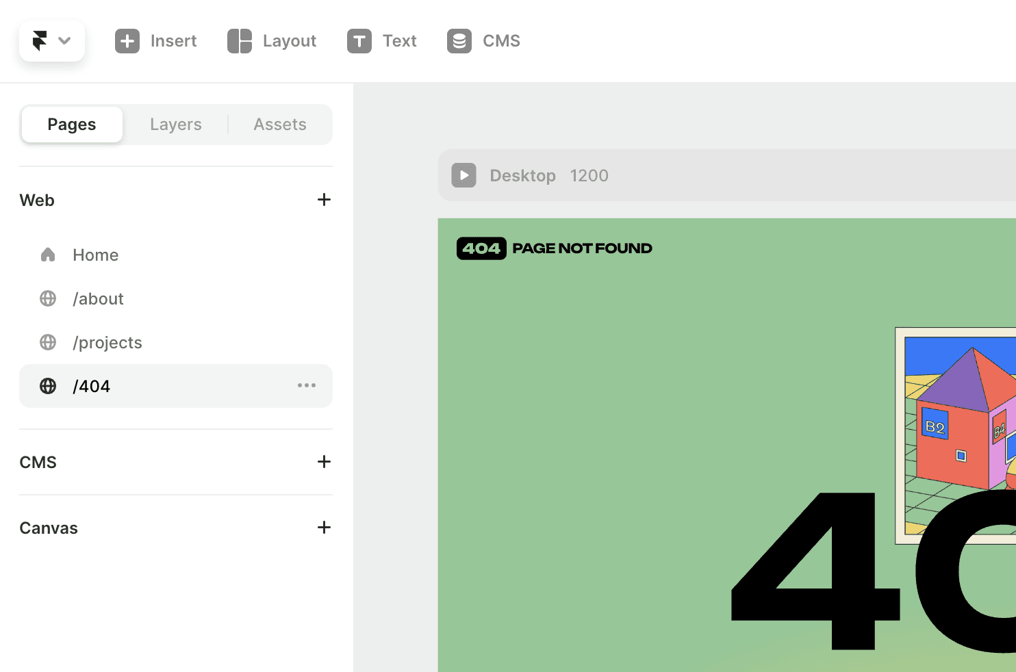
Creating your 404 page in Framer is super easy! All you need to do is create a new page and set the name to /404. From there, you can use any of the examples above or create your own unique 404 page using the powerful tools and components available in Framer.
In conclusion, creating a memorable and engaging 404 page is not only a fun and creative exercise but also an important part of providing a great user experience. With Framer, you have the tools and components to create stunning and playful 404 pages that will delight and engage your users. So why settle for a boring and generic error message when you can create something truly unique and memorable?
Playful No-Code Variations for Framer Sites
Who says 404 pages have to be boring? I've created a few playful no-code variations that you can use for your Framer sites. With Framer, you can easily remix these projects and customize them to suit your needs. These variations are not only fun and engaging but also help keep users on your site and guide them toward other areas of your website.
Using GIFs in Framer
I love that you can easily use GIFs in Framer. You can just drag and drop your GIF onto your canvas like any other static image! In one particular example, I used a lovely animation created by @YUX that I found on GIPHY. The animation added an element of surprise and delight to the 404 page, making the experience much more memorable for users.
Dreamy Animations with the Blur Effect
In another example, I used the fantastic work from Erica Anderson that I found on GIPHY and added a blurred effect to make it look dreamy. The blur also ensured that the animation scaled nicely for larger displays, making it more accessible to a wider audience.
Embedding 3D Typography to My Page
To create glossy letters for another 404 page, I used Spline. I then added the 3D render to my page using the Embed component from the Insert Menu. The result was a visually stunning 404 page that captured the attention of users and kept them engaged.
Using Text Masks
In another example, I used the Text Mask component from Benjamin den Boer. I used a looped GIF as a mask and adjusted its Y position. The result was a unique and eye-catching 404 page that stood out from the crowd. And just like the previous examples, this one was easy to create and customize in Framer.
Creating Gradient Animations with Loop Effects
For yet another 404 page, I created a subtle gradient animation using the Loop Effect. It featured a radial gradient with a Hue blending mode, animated to gradually adjust its scale and blend smoothly with the underlying gradient. This created a visually stunning effect that added depth and dimension to the 404 page.
Creating Your Own 404 Page in Framer
Creating your 404 page in Framer is super easy! All you need to do is create a new page and set the name to /404. From there, you can use any of the examples above or create your own unique 404 page using the powerful tools and components available in Framer.

In conclusion, creating a memorable and engaging 404 page is not only a fun and creative exercise but also an important part of providing a great user experience. With Framer, you have the tools and components to create stunning and playful 404 pages that will delight and engage your users. So why settle for a boring and generic error message when you can create something truly unique and memorable?
Playful No-Code Variations for Framer Sites
Who says 404 pages have to be boring? I've created a few playful no-code variations that you can use for your Framer sites. With Framer, you can easily remix these projects and customize them to suit your needs. These variations are not only fun and engaging but also help keep users on your site and guide them toward other areas of your website.
Using GIFs in Framer
I love that you can easily use GIFs in Framer. You can just drag and drop your GIF onto your canvas like any other static image! In one particular example, I used a lovely animation created by @YUX that I found on GIPHY. The animation added an element of surprise and delight to the 404 page, making the experience much more memorable for users.
Dreamy Animations with the Blur Effect
In another example, I used the fantastic work from Erica Anderson that I found on GIPHY and added a blurred effect to make it look dreamy. The blur also ensured that the animation scaled nicely for larger displays, making it more accessible to a wider audience.
Embedding 3D Typography to My Page
To create glossy letters for another 404 page, I used Spline. I then added the 3D render to my page using the Embed component from the Insert Menu. The result was a visually stunning 404 page that captured the attention of users and kept them engaged.
Using Text Masks
In another example, I used the Text Mask component from Benjamin den Boer. I used a looped GIF as a mask and adjusted its Y position. The result was a unique and eye-catching 404 page that stood out from the crowd. And just like the previous examples, this one was easy to create and customize in Framer.
Creating Gradient Animations with Loop Effects
For yet another 404 page, I created a subtle gradient animation using the Loop Effect. It featured a radial gradient with a Hue blending mode, animated to gradually adjust its scale and blend smoothly with the underlying gradient. This created a visually stunning effect that added depth and dimension to the 404 page.
Creating Your Own 404 Page in Framer
Creating your 404 page in Framer is super easy! All you need to do is create a new page and set the name to /404. From there, you can use any of the examples above or create your own unique 404 page using the powerful tools and components available in Framer.

In conclusion, creating a memorable and engaging 404 page is not only a fun and creative exercise but also an important part of providing a great user experience. With Framer, you have the tools and components to create stunning and playful 404 pages that will delight and engage your users. So why settle for a boring and generic error message when you can create something truly unique and memorable?

Step into the future of design
Step into the future of design
Step into the future of design
Join thousands using Framer to build high-performing websites fast.
Join thousands using Framer to build high-performing websites fast.
Join thousands using Framer to build high-performing websites fast.


