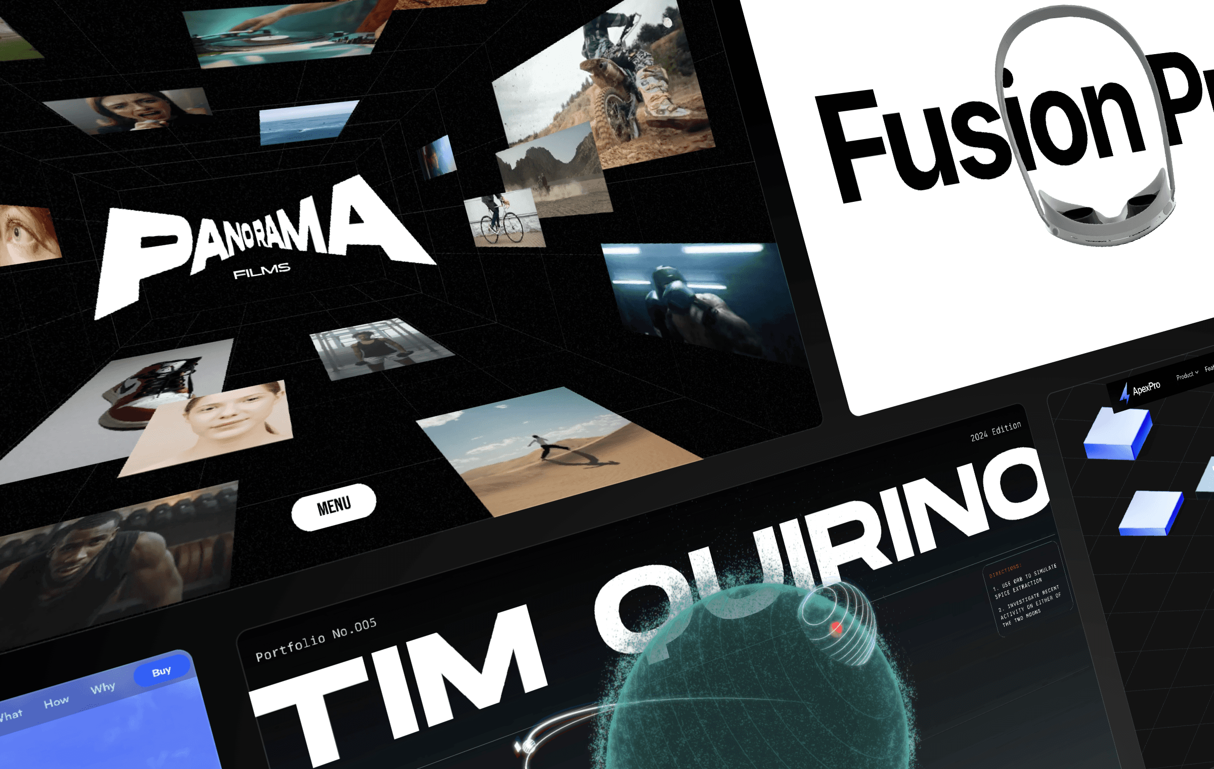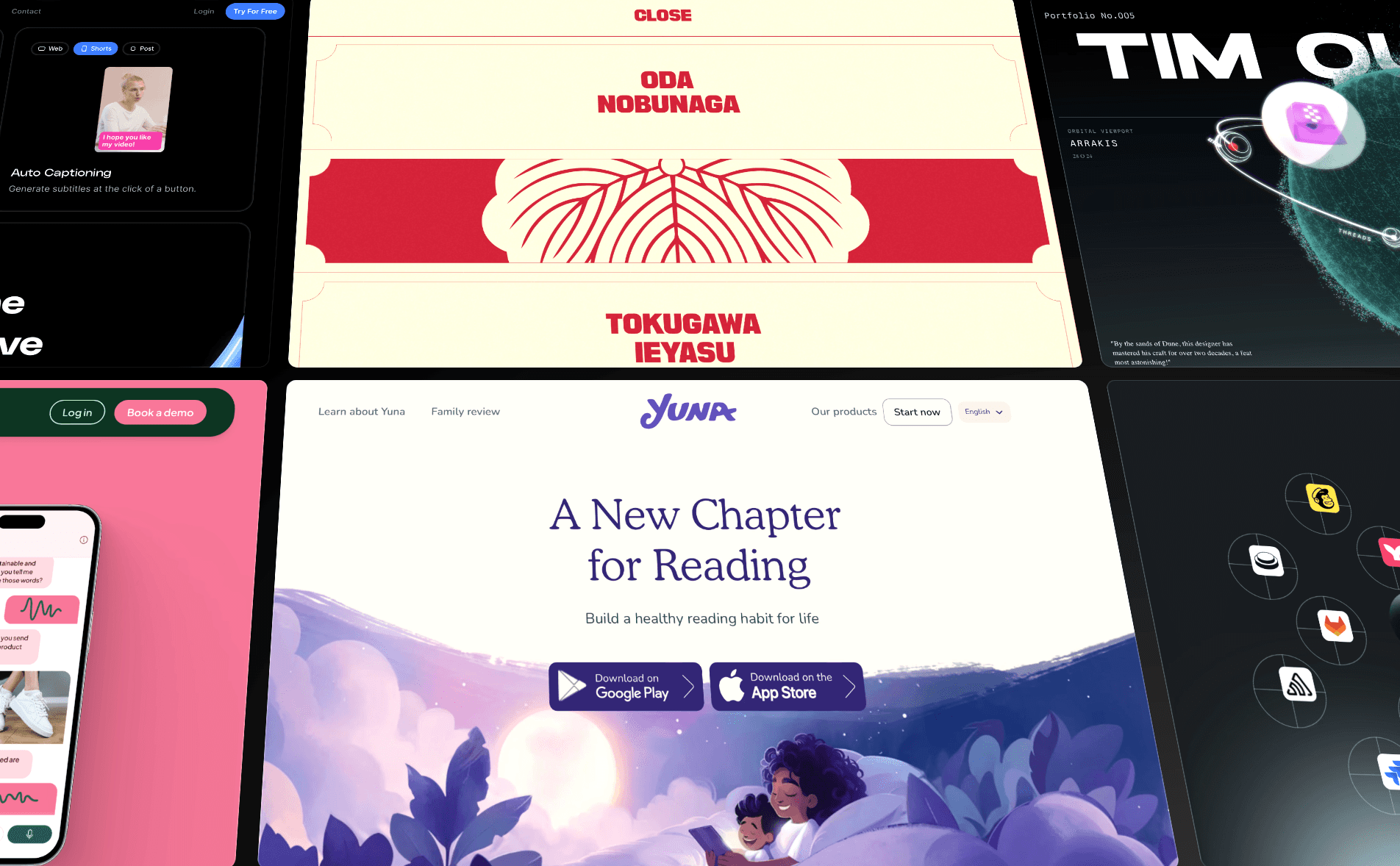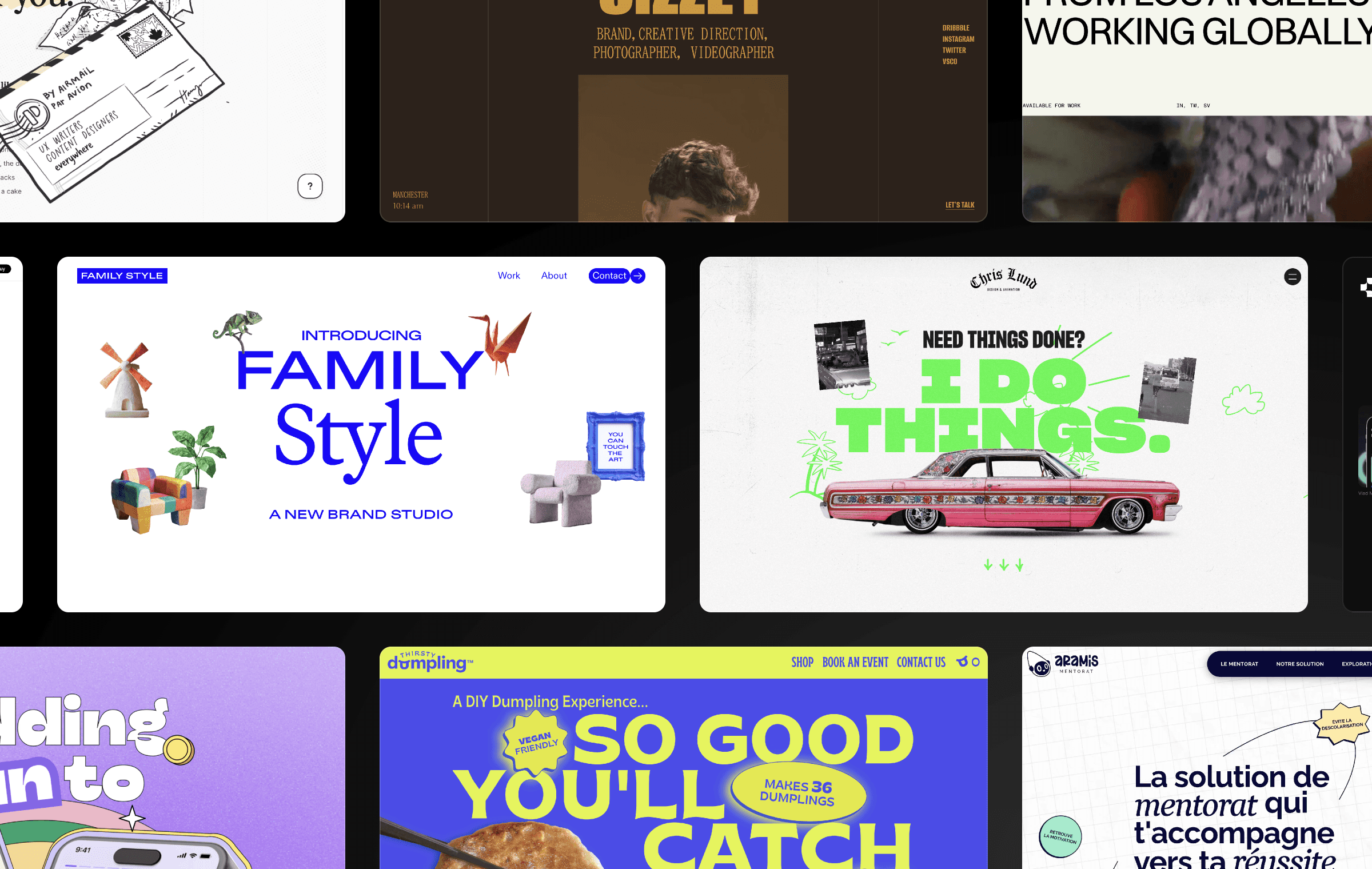


Web design trends come and go. Sometimes it’s obvious when a trend has fizzled out: for example, not many designers are currently deploying 1990s-era trends like Flash splash pages, visitor counters, and auto-playing music. But it can be hard to know when more contemporary web design trends have run their course, and when new trends have taken their place.
To inspire your next project—and to keep you up-to-date—we've curated a collection of website design examples that showcase the most impactful trends for 2025. From micro animations to human-crafted illustrations, explore how different web design approaches can differentiate your brand and enhance your user experience.
1. Engage Users with Interactivity
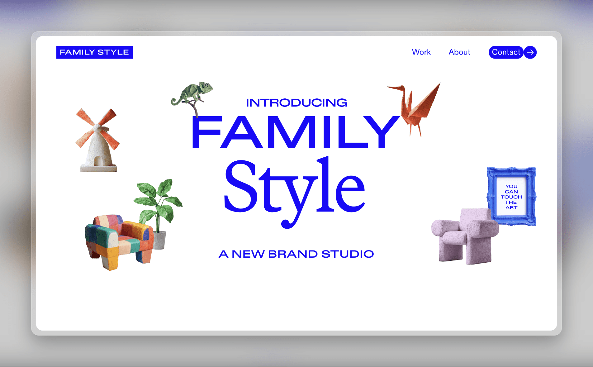
Static websites are giving way to more engaging, interactive digital experiences. Family Style, a digital agency, has a playful home page full of levitating objects that you can click and drag around. For brands in creative industries, or those targeting a younger audience, this interactive style is increasingly common.
The benefits aren’t just aesthetic. Elements like hover effects, scroll-triggered animations, and interactive objects encourage users to spend more time on your website, which can lead to higher conversions. And by making your site more dynamic and playful, your brand becomes more memorable and has greater positive associations among customers.
Template — FFProduct
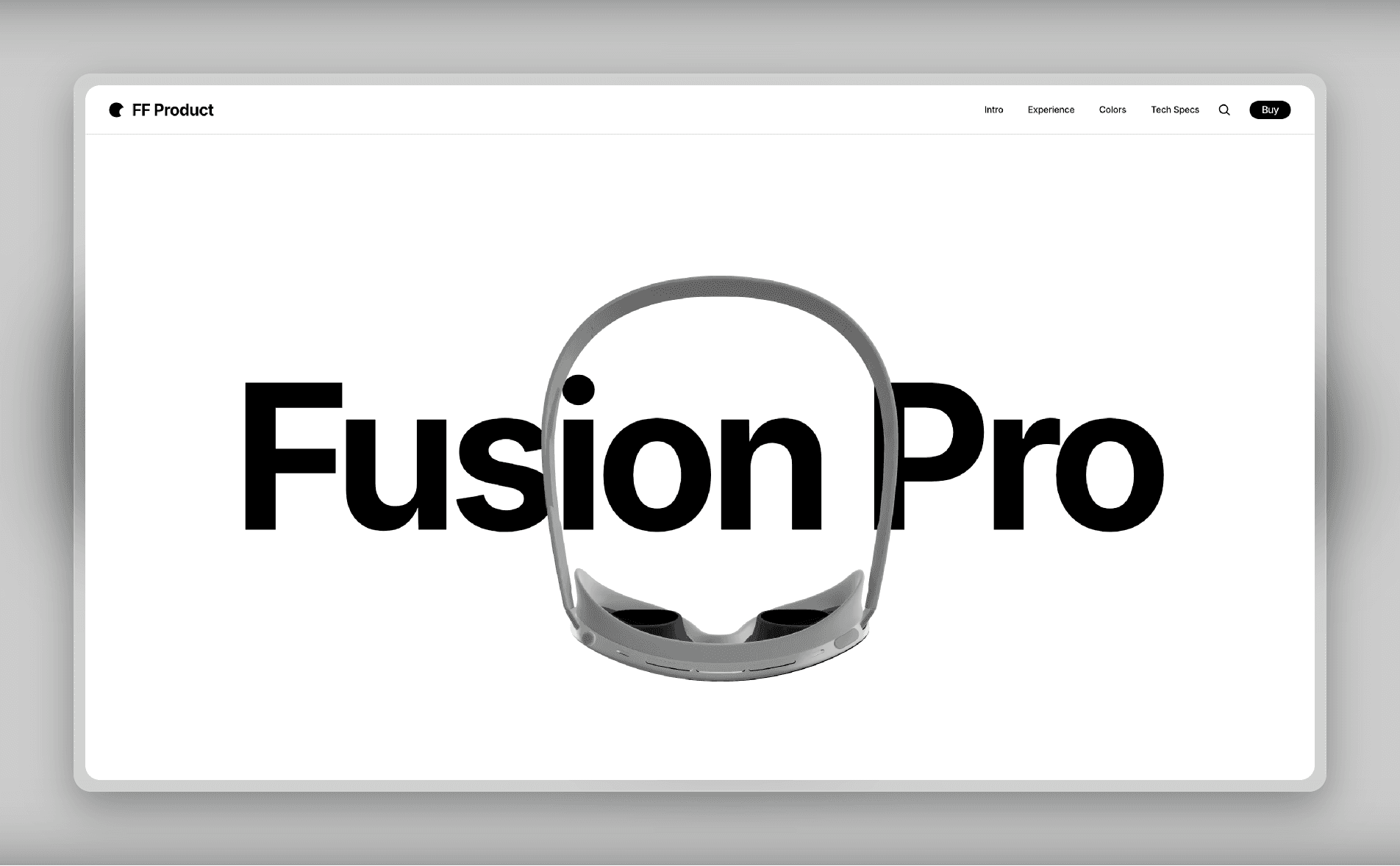
To make your site more interactive, start by experimenting with floating objects, hover effects, and animated cursor trails. Scrolling effects are another place to add dynamism.
You can get started quickly with FFProduct, a premium one-page Framer template designed to craft landing pages that drive product sales. Each section features finely tuned animations, creating a visually stunning and interactive experience to captivate your audience.
2. Incorporate Nostalgic Retro Elements
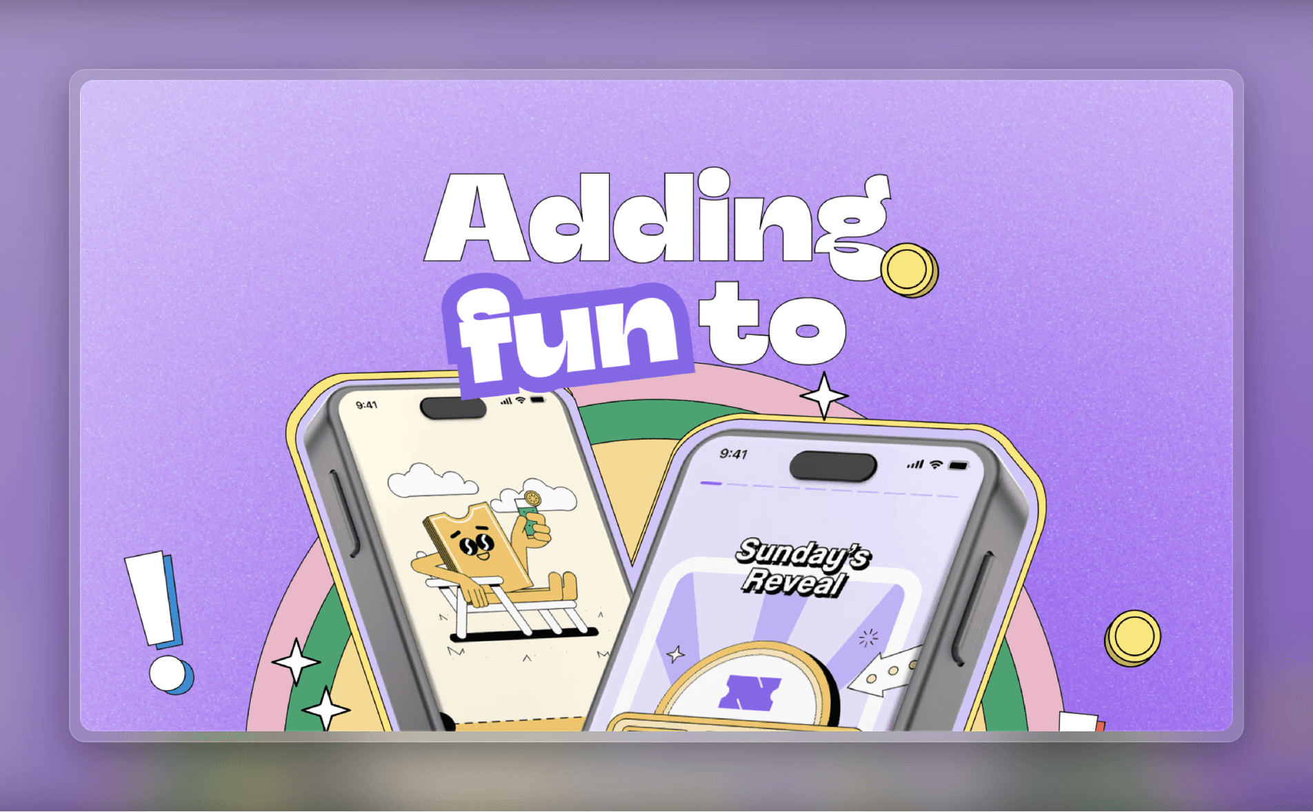
Retro design elements like bold typography, grainy textures, and ’80s-inspired palettes are making a comeback. Nolo, a (fictional) financial app, features a landing page full of groovy fonts and other retro touches. The retro design movement is one way for brands to stand out in a sea of modern and minimalist sites.
In addition to making your brand more memorable, retro designs can also tap into users’ nostalgia, creating powerful emotional connections. Retro designs are a bold statement, so they aren’t for everyone—but if your brand is looking to stand out, going retro might be just what you need.
Template — Sizzey
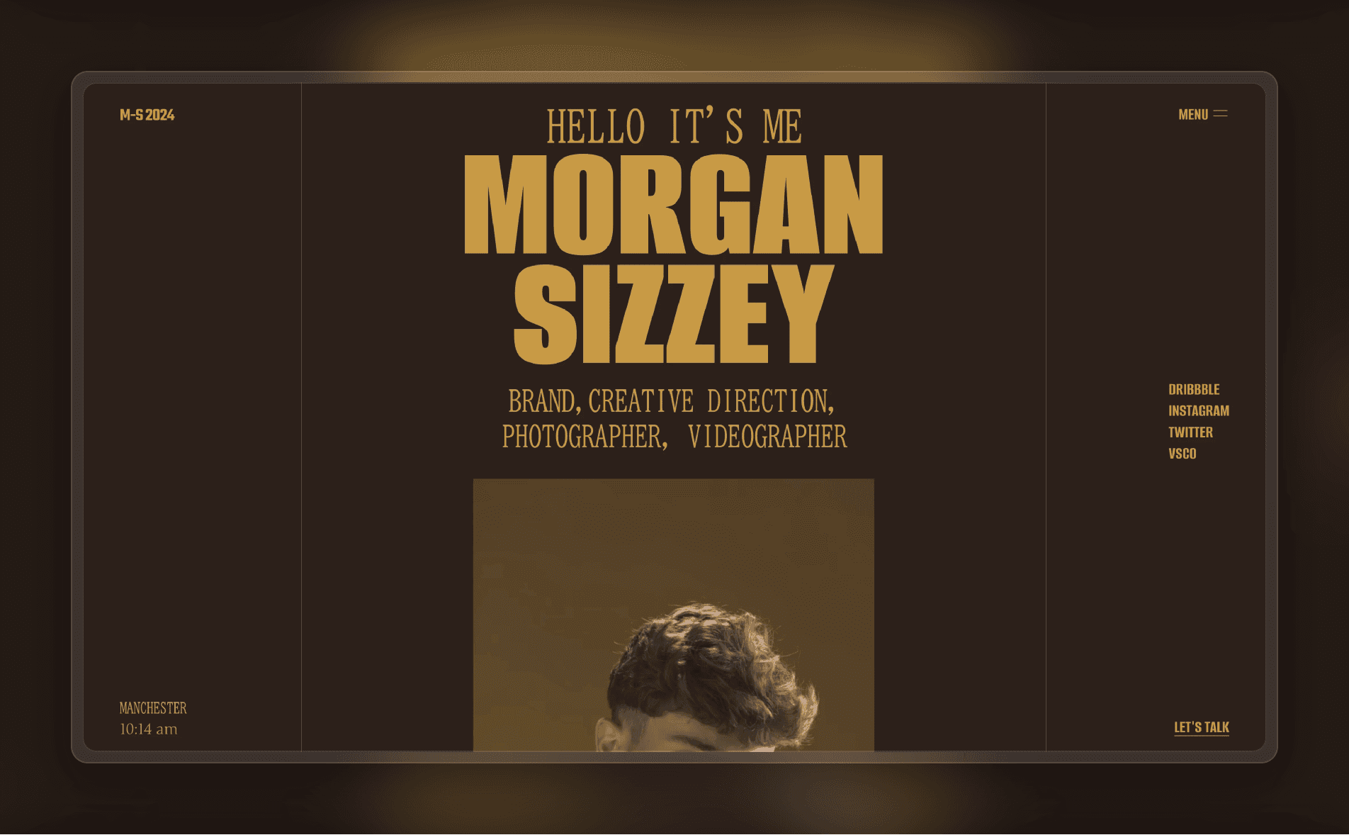
To retro-ify your site, start by choosing an era to use as your motif. (Hint: if you’re flexible, go with the formative years of your target customers for extra nostalgia points.) Then, incorporate retro fonts with dramatic weights and bold colors, along with grainy textures and faded colors to create a vintage look. Consider using decorative elements, like borders or patterns, to add extra oomph.
You can get started quickly with Sizzey, a Framer template featuring a bold color palette and vintage-inspired fonts.
3. Stay Authentic with Human-Crafted Designs
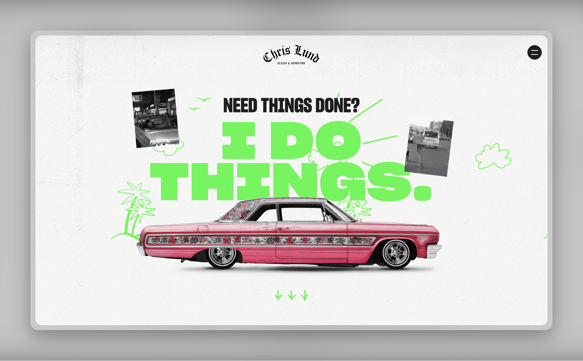
As pixel-perfect AI-generated content becomes more prevalent, there is a growing movement towards designs that feel imperfect and overtly human. Chris Lund, a designer, exhibits this design philosophy on his personal portfolio site. It looks more like a scrapbook than a traditional website, full of a casual assortment of photos, video clips, and animations, along with unfussy website copy.
While designs like this aren’t particularly polished, that’s part of their appeal. Human-crafted designs add a sense of individuality and authenticity; as a result, the brand (or person) behind the design feels more relatable and approachable to visitors.
Template — Hanssen
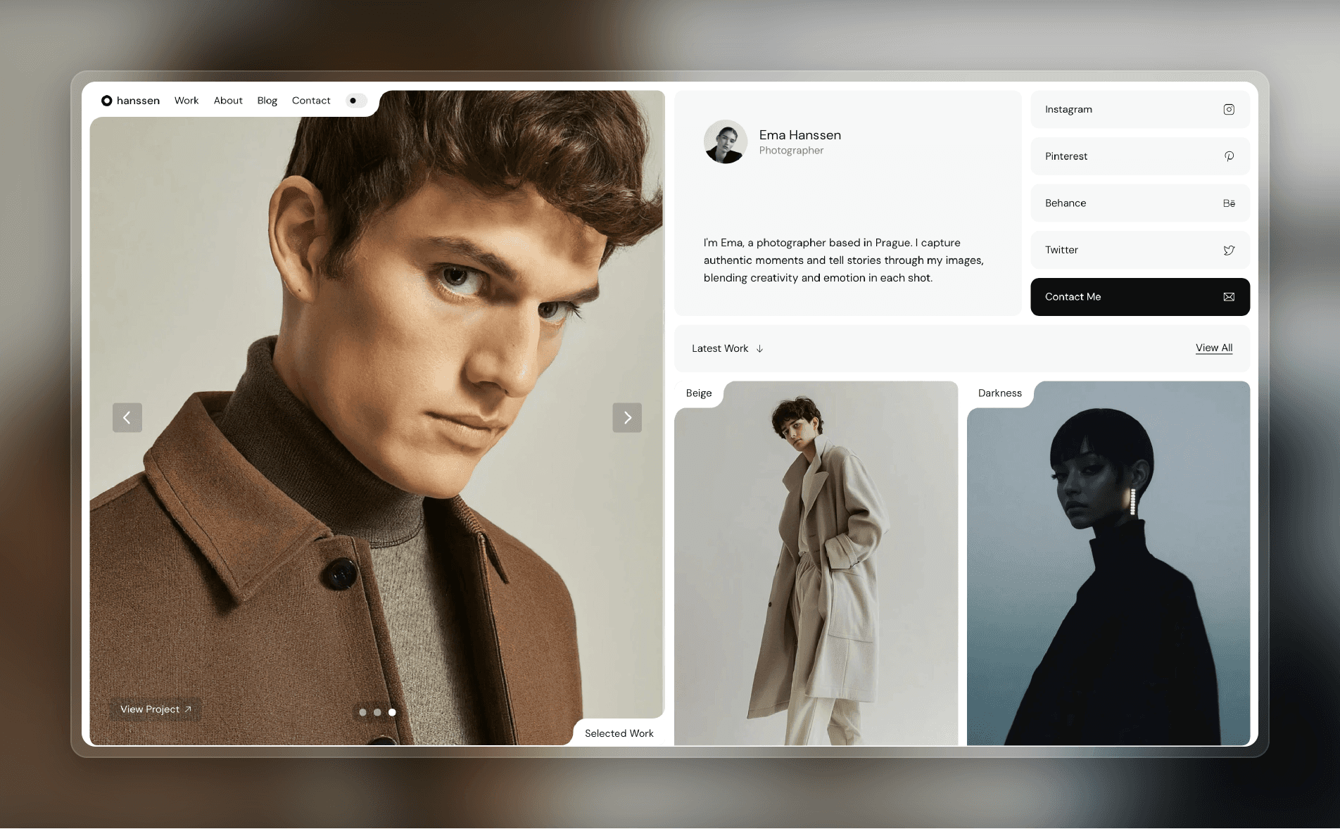
To create a human-crafted design, start by setting aside any notion of perfection. Instead, lean into authenticity: the key thing is that your brand’s personality needs to come through unfiltered. (In other words, don’t be afraid to get weird.) Using human-crafted design elements can help too: handmade illustrations, script fonts, and organic textures can all add a human touch to digital experiences.
For a quick way to get started with a handcrafted look and feel, try Hanssen, a Framer template featuring clean layouts, subtle animations, and fonts with a natural, personal touch.
4. Stand Out with Vivid Colors
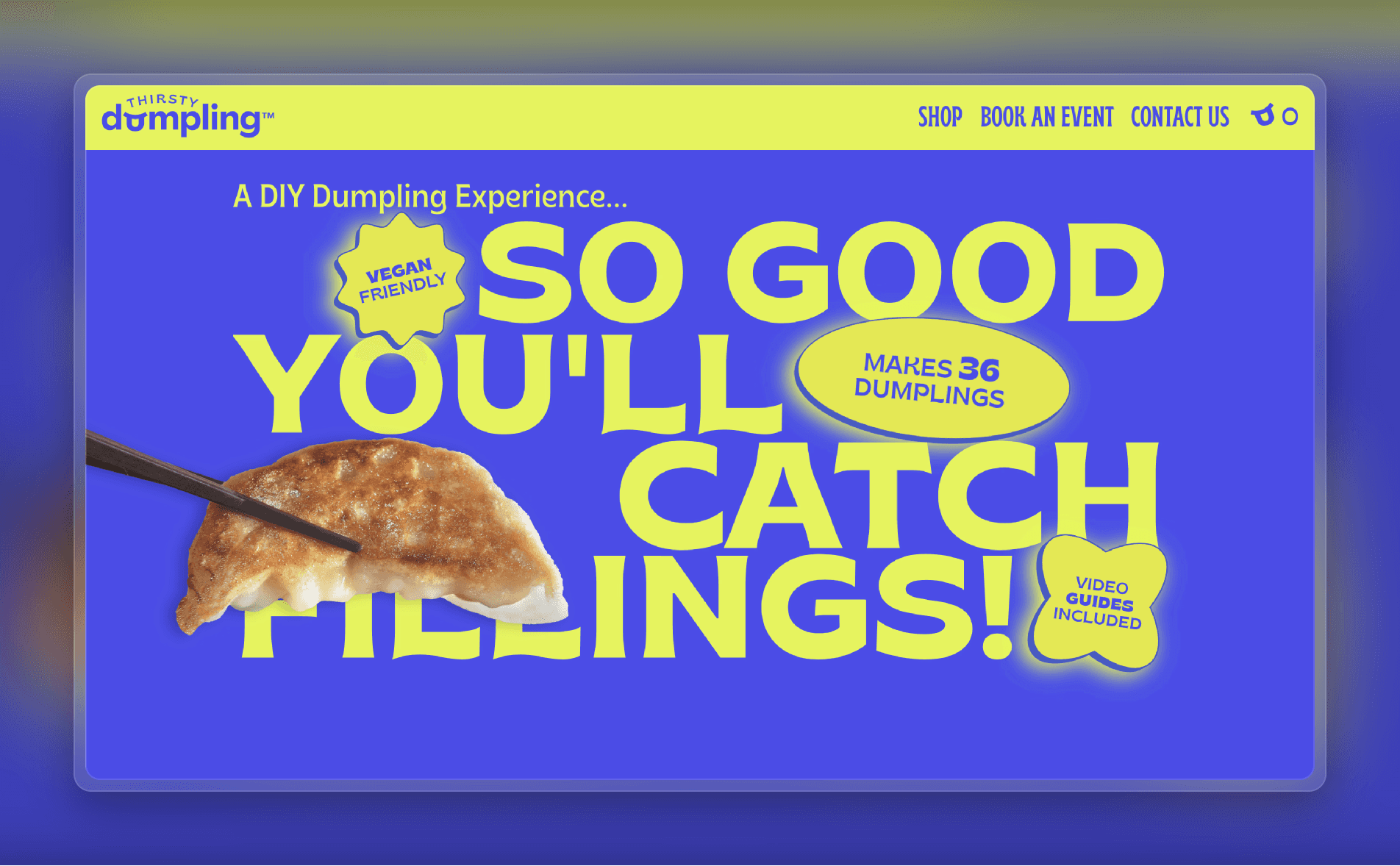
Subdued color schemes make sense for corporate websites, but they can fall flat if your brand stands for something fun or edgy. Thirsty Dumpling, a business selling DIY dumpling-making kits, uses neon green and blue as its two primary colors. (They’re not afraid of neon green backgrounds, either.)
Bright and bold colors help create a memorable brand identity. They’re also more likely to grab users’ attention, convey a sense of energy, and elicit a strong emotional response.
Template — Jacob Turner
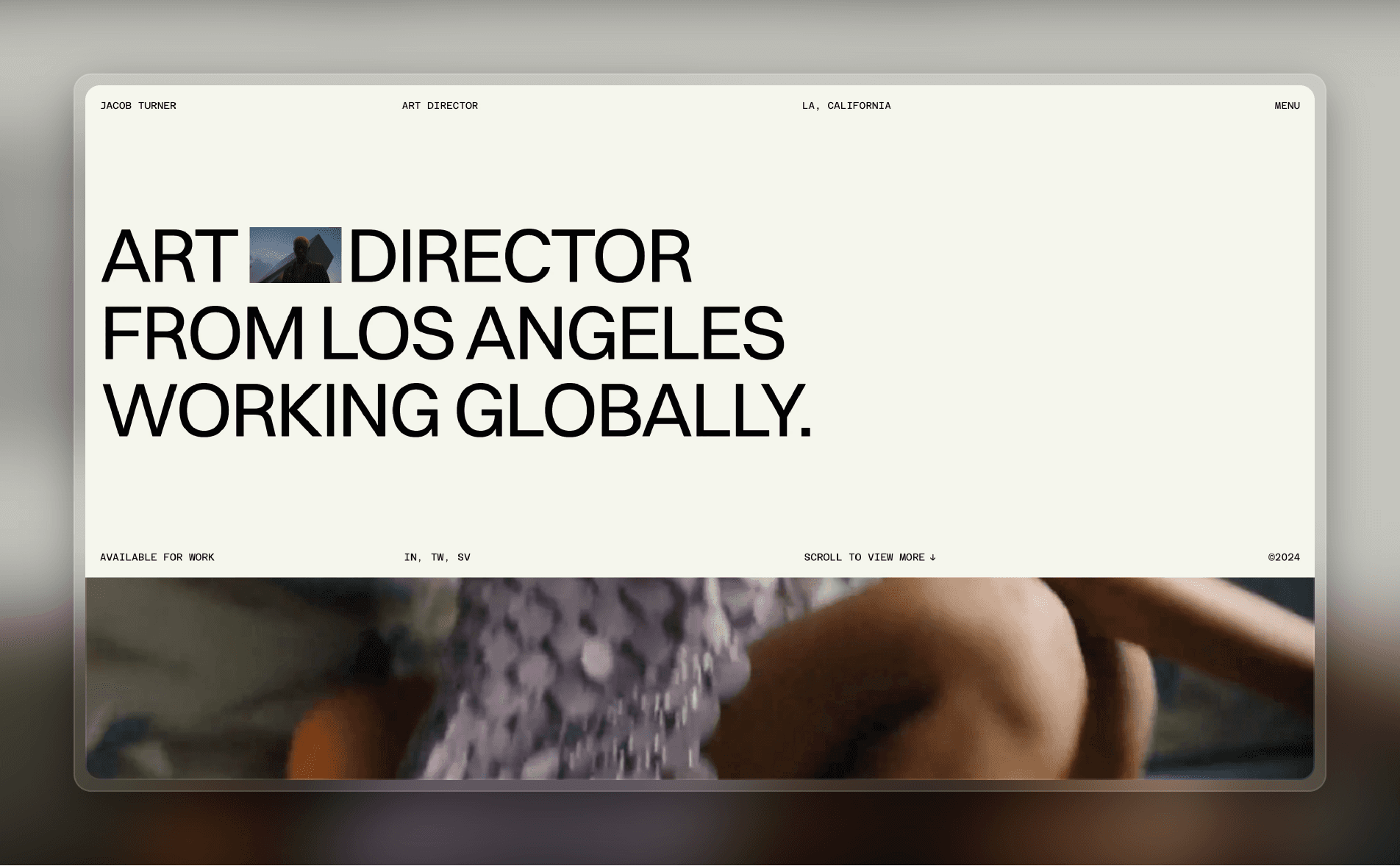
When you create a design using a bold color palette, remember that the goal isn’t just to be eye-catching; you want to also use those bold colors to evoke an energy that aligns with your brand. As a result, the first step is to understand how your brand’s messaging affects your design. Once you’re clear on the energy you want to convey, use design tools like high-contrast color pairings, saturated color schemes, and bright accent colors to get your message across.
You can get started quickly with Jacob Turner, a premium Framer template designed for art directors and creative professionals, featuring a bold and distinctive aesthetic to showcase your projects with character and class.
5. Boost Usability with Dark Mode
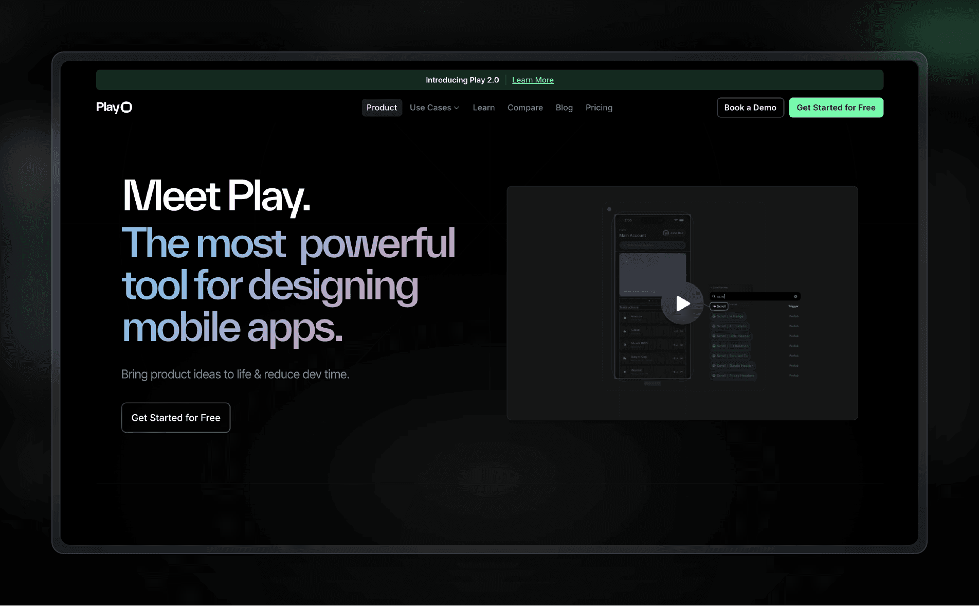
Dark mode—once a simple accessibility feature that inverted colors—is now a sophisticated design approach in its own right. Play, a design and prototyping tool, defaults to dark mode on its website, which is targeted at an audience of developers and designers. (The dark mode aesthetic has a certain cachet among tech-savvy users, making dark mode particularly common among SaaS apps.)
Apart from its accessibility benefits, including reduced eye strain, dark mode is trending due to its sleek aesthetic and enhanced low-light readability. It’s also more energy efficient, which results in better battery life on mobile devices. You don’t necessarily have to choose between dark mode and light mode: building a dark mode toggle into your design lets users select whichever they prefer.
Template — Atomic
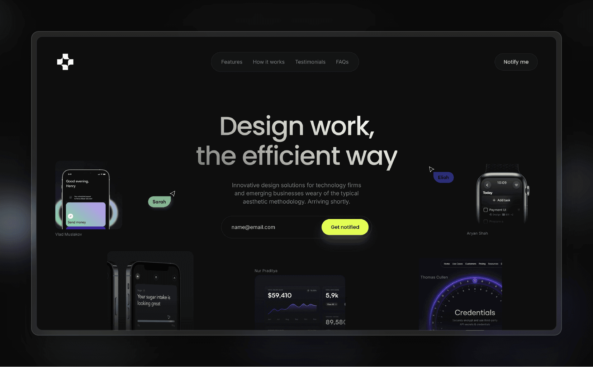
When designing for dark mode, make readability a priority by using high-contrast typography and color pairings that stand out against darker backgrounds. Dark mode also gives you a chance to play with creative visuals that aren’t as effective in light mode, like glowing neon accents and highlights.
With Framer, you can easily jump between light mode and dark mode while designing, allowing you to customize the user experience in each mode. One tip: avoid using pure black, which can cause eye strain and issues when scrolling on some OLED screens. (Google’s Material Design guidelines suggest dark gray instead.)
To get started quickly, try Atomic, a Framer template that offers a slick dark mode experience.
6. Embrace Visual Storytelling with Illustrations
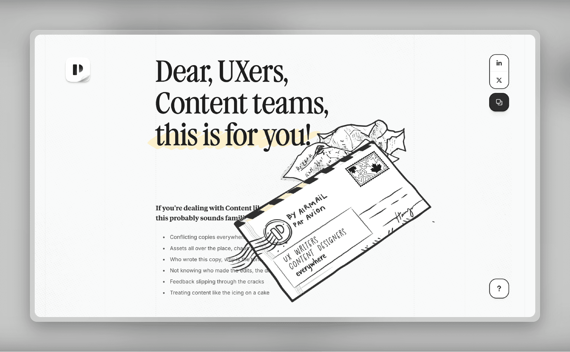
Generic stock photos are losing ground to custom illustrations and line art. Punkt, a UX writing and content design platform, uses bespoke drawings—some of them animated—throughout the homepage to tell its story.
Line art and hand-drawn illustrations have a number of benefits apart from simply looking unique. Custom drawings are excellent for storytelling: unlike stock photos, you can tailor each piece of imagery to create a visual narrative that accompanies your text. Brand cohesion also improves because your visual style is consistent across your website. Plus, line art is typically quicker-loading and more scalable than other types of images.
Template — AInbox
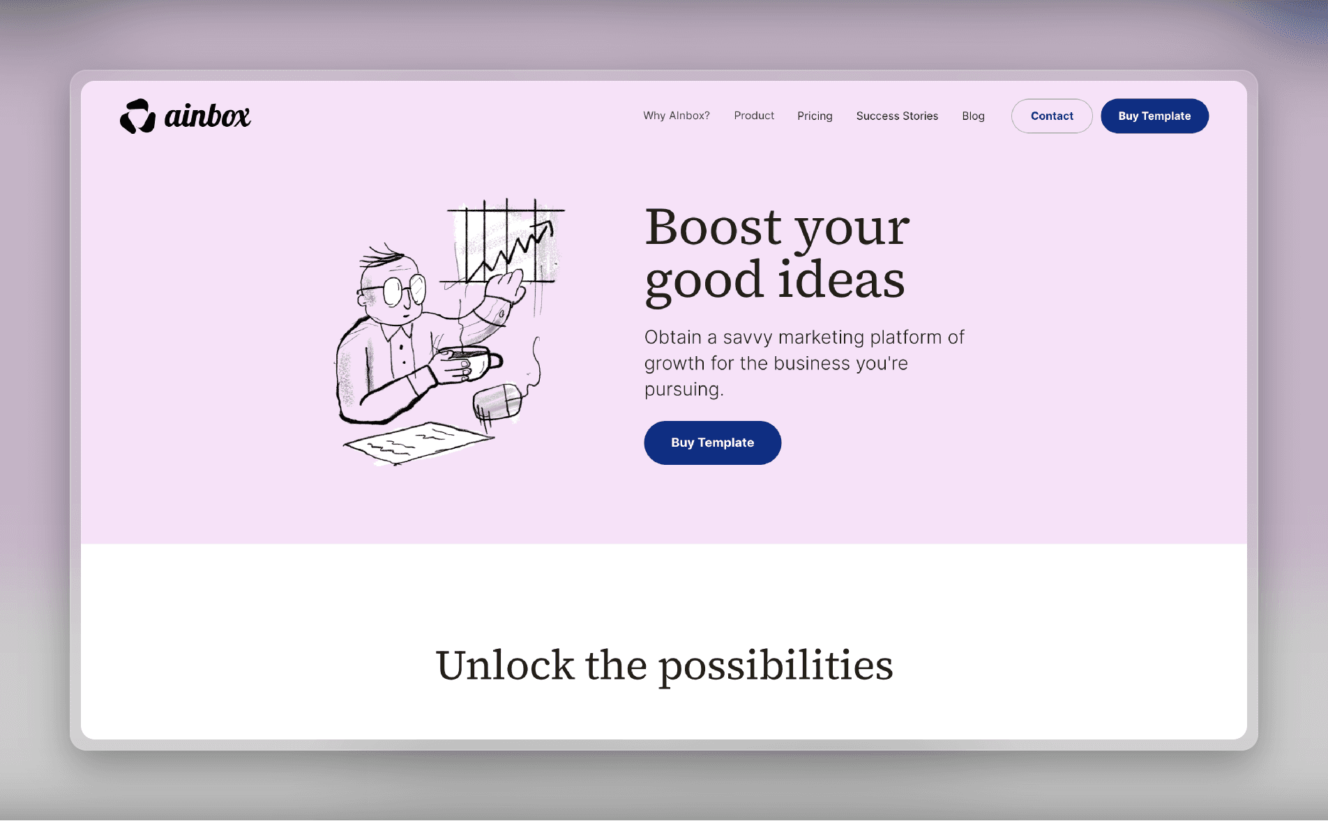
When creating illustrations, make sure they resonate with your brand’s identity and messaging. Kick things off with a few illustrations to add personality in strategic areas, like hero sections, core features, and icons. When you’re ready to go more in-depth, consider enhancing your existing content by experimenting with visual storytelling.
If you want to get started quickly, check out AInbox, a Framer template featuring line art on hero images and icons throughout the website.
7. Delight Users with Micro Animations
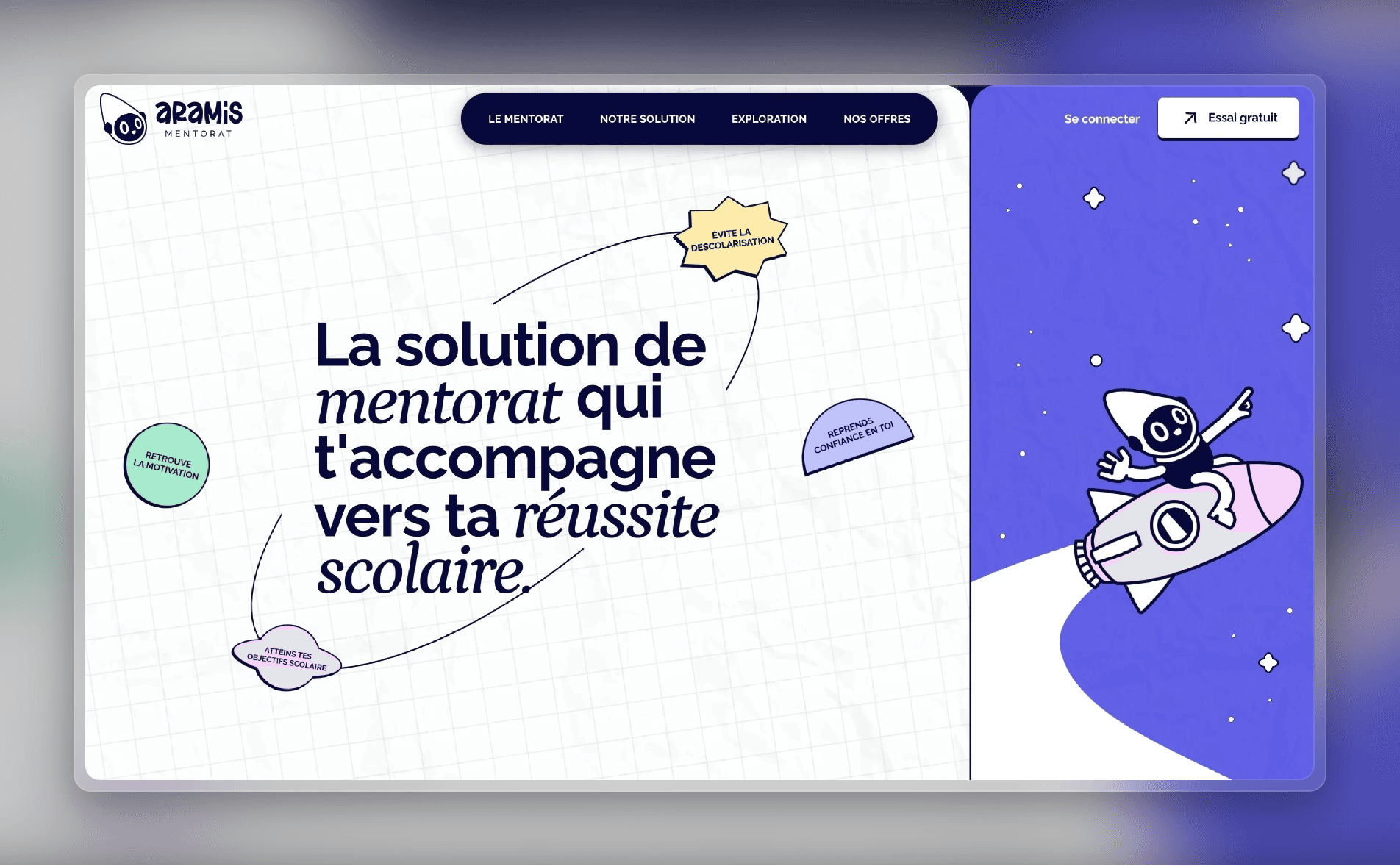
Micro animations enhance your users’ website experience by adding small animations that guide user actions. Motion design goes a step further by integrating movement in a way that adds depth and engagement. Aramis, a student mentoring company, features both micro animations (like dynamic icons) and motion design.
These elements aren’t just decorative—they help users navigate the site and provide visual cues for interactions. Adding micro animations and motion design elements to your site can boost engagement, improve the user journey, and create an emotional connection with visitors.
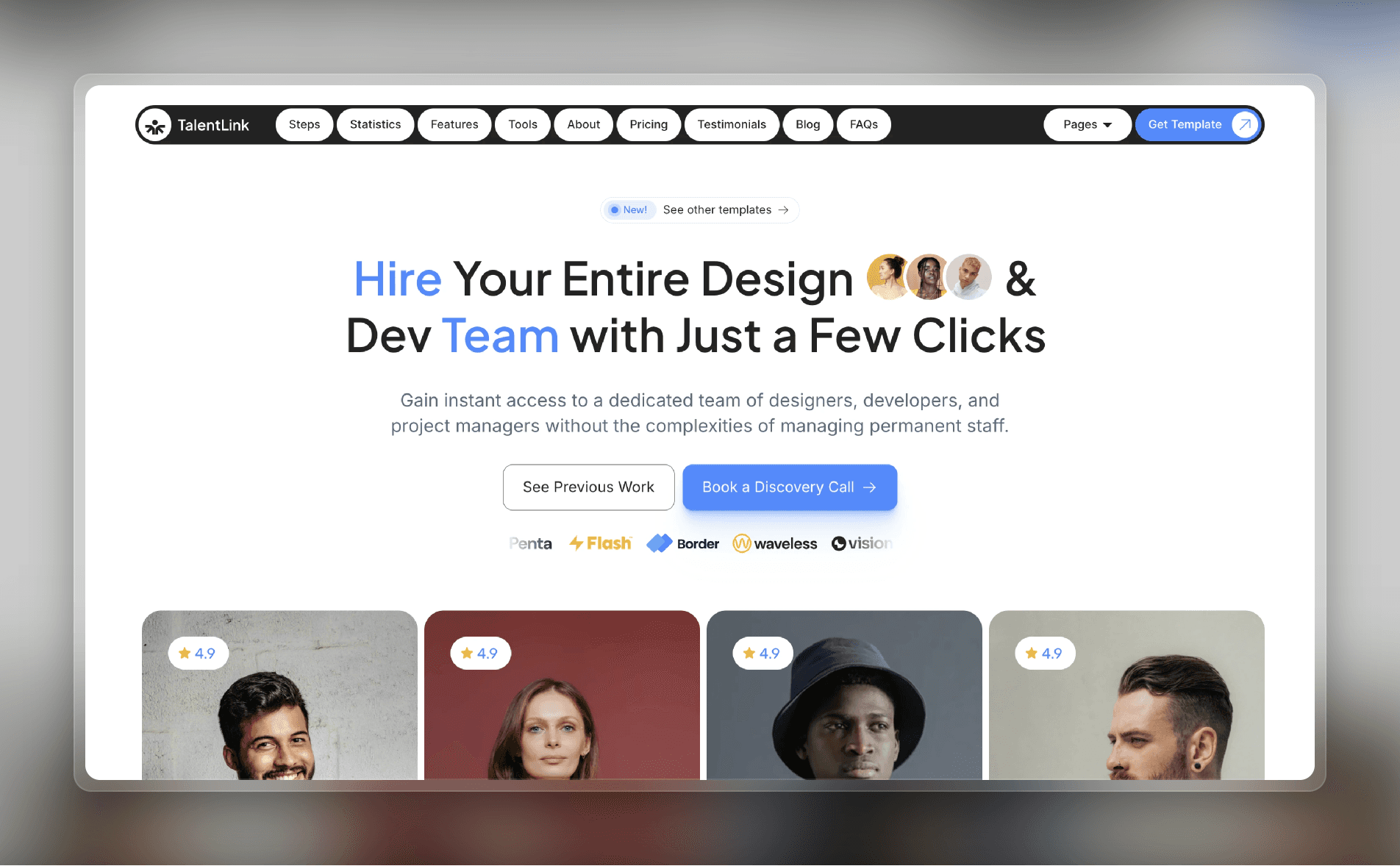
Template — TalentLink
As you start adding micro animations and motion design elements to your website, a word of caution: don’t go too wild with it (at least at first). You run the risk of distracting users and increasing loading times. Start by adding subtle animations—like hover effects, button animations, and scrolling effects—to areas with frequent user interaction. Then, gauge your users’ response.
For a quick start, try TalentLink, a Framer template featuring hover effects, mouse-trigger animations, interactive elements, and more.
Stay Ahead With Trend-Setting Web Designs
By incorporating the latest web design trends, you can transform your website from a static page into a vibrant, engaging experience that resonates with users. With trends like interactivity, custom illustrations, vibrant color palettes, and motion design, you can strengthen your brand identity, boost conversions, and leave customers with a lasting impression.
Ready to incorporate the latest web design trends? Get inspired by our latest examples in the Framer design gallery, kickstart your project with our templates, and sign up for a Framer account to start building today.
To inspire your next project—and to keep you up-to-date—we've curated a collection of website design examples that showcase the most impactful trends for 2025. From micro animations to human-crafted illustrations, explore how different web design approaches can differentiate your brand and enhance your user experience.
1. Engage Users with Interactivity

Static websites are giving way to more engaging, interactive digital experiences. Family Style, a digital agency, has a playful home page full of levitating objects that you can click and drag around. For brands in creative industries, or those targeting a younger audience, this interactive style is increasingly common.
The benefits aren’t just aesthetic. Elements like hover effects, scroll-triggered animations, and interactive objects encourage users to spend more time on your website, which can lead to higher conversions. And by making your site more dynamic and playful, your brand becomes more memorable and has greater positive associations among customers.
Template — FFProduct

To make your site more interactive, start by experimenting with floating objects, hover effects, and animated cursor trails. Scrolling effects are another place to add dynamism.
You can get started quickly with FFProduct, a premium one-page Framer template designed to craft landing pages that drive product sales. Each section features finely tuned animations, creating a visually stunning and interactive experience to captivate your audience.
2. Incorporate Nostalgic Retro Elements

Retro design elements like bold typography, grainy textures, and ’80s-inspired palettes are making a comeback. Nolo, a (fictional) financial app, features a landing page full of groovy fonts and other retro touches. The retro design movement is one way for brands to stand out in a sea of modern and minimalist sites.
In addition to making your brand more memorable, retro designs can also tap into users’ nostalgia, creating powerful emotional connections. Retro designs are a bold statement, so they aren’t for everyone—but if your brand is looking to stand out, going retro might be just what you need.
Template — Sizzey

To retro-ify your site, start by choosing an era to use as your motif. (Hint: if you’re flexible, go with the formative years of your target customers for extra nostalgia points.) Then, incorporate retro fonts with dramatic weights and bold colors, along with grainy textures and faded colors to create a vintage look. Consider using decorative elements, like borders or patterns, to add extra oomph.
You can get started quickly with Sizzey, a Framer template featuring a bold color palette and vintage-inspired fonts.
3. Stay Authentic with Human-Crafted Designs

As pixel-perfect AI-generated content becomes more prevalent, there is a growing movement towards designs that feel imperfect and overtly human. Chris Lund, a designer, exhibits this design philosophy on his personal portfolio site. It looks more like a scrapbook than a traditional website, full of a casual assortment of photos, video clips, and animations, along with unfussy website copy.
While designs like this aren’t particularly polished, that’s part of their appeal. Human-crafted designs add a sense of individuality and authenticity; as a result, the brand (or person) behind the design feels more relatable and approachable to visitors.
Template — Hanssen

To create a human-crafted design, start by setting aside any notion of perfection. Instead, lean into authenticity: the key thing is that your brand’s personality needs to come through unfiltered. (In other words, don’t be afraid to get weird.) Using human-crafted design elements can help too: handmade illustrations, script fonts, and organic textures can all add a human touch to digital experiences.
For a quick way to get started with a handcrafted look and feel, try Hanssen, a Framer template featuring clean layouts, subtle animations, and fonts with a natural, personal touch.
4. Stand Out with Vivid Colors

Subdued color schemes make sense for corporate websites, but they can fall flat if your brand stands for something fun or edgy. Thirsty Dumpling, a business selling DIY dumpling-making kits, uses neon green and blue as its two primary colors. (They’re not afraid of neon green backgrounds, either.)
Bright and bold colors help create a memorable brand identity. They’re also more likely to grab users’ attention, convey a sense of energy, and elicit a strong emotional response.
Template — Jacob Turner

When you create a design using a bold color palette, remember that the goal isn’t just to be eye-catching; you want to also use those bold colors to evoke an energy that aligns with your brand. As a result, the first step is to understand how your brand’s messaging affects your design. Once you’re clear on the energy you want to convey, use design tools like high-contrast color pairings, saturated color schemes, and bright accent colors to get your message across.
You can get started quickly with Jacob Turner, a premium Framer template designed for art directors and creative professionals, featuring a bold and distinctive aesthetic to showcase your projects with character and class.
5. Boost Usability with Dark Mode

Dark mode—once a simple accessibility feature that inverted colors—is now a sophisticated design approach in its own right. Play, a design and prototyping tool, defaults to dark mode on its website, which is targeted at an audience of developers and designers. (The dark mode aesthetic has a certain cachet among tech-savvy users, making dark mode particularly common among SaaS apps.)
Apart from its accessibility benefits, including reduced eye strain, dark mode is trending due to its sleek aesthetic and enhanced low-light readability. It’s also more energy efficient, which results in better battery life on mobile devices. You don’t necessarily have to choose between dark mode and light mode: building a dark mode toggle into your design lets users select whichever they prefer.
Template — Atomic

When designing for dark mode, make readability a priority by using high-contrast typography and color pairings that stand out against darker backgrounds. Dark mode also gives you a chance to play with creative visuals that aren’t as effective in light mode, like glowing neon accents and highlights.
With Framer, you can easily jump between light mode and dark mode while designing, allowing you to customize the user experience in each mode. One tip: avoid using pure black, which can cause eye strain and issues when scrolling on some OLED screens. (Google’s Material Design guidelines suggest dark gray instead.)
To get started quickly, try Atomic, a Framer template that offers a slick dark mode experience.
6. Embrace Visual Storytelling with Illustrations

Generic stock photos are losing ground to custom illustrations and line art. Punkt, a UX writing and content design platform, uses bespoke drawings—some of them animated—throughout the homepage to tell its story.
Line art and hand-drawn illustrations have a number of benefits apart from simply looking unique. Custom drawings are excellent for storytelling: unlike stock photos, you can tailor each piece of imagery to create a visual narrative that accompanies your text. Brand cohesion also improves because your visual style is consistent across your website. Plus, line art is typically quicker-loading and more scalable than other types of images.
Template — AInbox

When creating illustrations, make sure they resonate with your brand’s identity and messaging. Kick things off with a few illustrations to add personality in strategic areas, like hero sections, core features, and icons. When you’re ready to go more in-depth, consider enhancing your existing content by experimenting with visual storytelling.
If you want to get started quickly, check out AInbox, a Framer template featuring line art on hero images and icons throughout the website.
7. Delight Users with Micro Animations

Micro animations enhance your users’ website experience by adding small animations that guide user actions. Motion design goes a step further by integrating movement in a way that adds depth and engagement. Aramis, a student mentoring company, features both micro animations (like dynamic icons) and motion design.
These elements aren’t just decorative—they help users navigate the site and provide visual cues for interactions. Adding micro animations and motion design elements to your site can boost engagement, improve the user journey, and create an emotional connection with visitors.
Template — TalentLink

As you start adding micro animations and motion design elements to your website, a word of caution: don’t go too wild with it (at least at first). You run the risk of distracting users and increasing loading times. Start by adding subtle animations—like hover effects, button animations, and scrolling effects—to areas with frequent user interaction. Then, gauge your users’ response.
For a quick start, try TalentLink, a Framer template featuring hover effects, mouse-trigger animations, interactive elements, and more.
Stay Ahead With Trend-Setting Web Designs
By incorporating the latest web design trends, you can transform your website from a static page into a vibrant, engaging experience that resonates with users. With trends like interactivity, custom illustrations, vibrant color palettes, and motion design, you can strengthen your brand identity, boost conversions, and leave customers with a lasting impression.
Ready to incorporate the latest web design trends? Get inspired by our latest examples in the Framer design gallery, kickstart your project with our templates, and sign up for a Framer account to start building today.
To inspire your next project—and to keep you up-to-date—we've curated a collection of website design examples that showcase the most impactful trends for 2025. From micro animations to human-crafted illustrations, explore how different web design approaches can differentiate your brand and enhance your user experience.
1. Engage Users with Interactivity

Static websites are giving way to more engaging, interactive digital experiences. Family Style, a digital agency, has a playful home page full of levitating objects that you can click and drag around. For brands in creative industries, or those targeting a younger audience, this interactive style is increasingly common.
The benefits aren’t just aesthetic. Elements like hover effects, scroll-triggered animations, and interactive objects encourage users to spend more time on your website, which can lead to higher conversions. And by making your site more dynamic and playful, your brand becomes more memorable and has greater positive associations among customers.
Template — FFProduct

To make your site more interactive, start by experimenting with floating objects, hover effects, and animated cursor trails. Scrolling effects are another place to add dynamism.
You can get started quickly with FFProduct, a premium one-page Framer template designed to craft landing pages that drive product sales. Each section features finely tuned animations, creating a visually stunning and interactive experience to captivate your audience.
2. Incorporate Nostalgic Retro Elements

Retro design elements like bold typography, grainy textures, and ’80s-inspired palettes are making a comeback. Nolo, a (fictional) financial app, features a landing page full of groovy fonts and other retro touches. The retro design movement is one way for brands to stand out in a sea of modern and minimalist sites.
In addition to making your brand more memorable, retro designs can also tap into users’ nostalgia, creating powerful emotional connections. Retro designs are a bold statement, so they aren’t for everyone—but if your brand is looking to stand out, going retro might be just what you need.
Template — Sizzey

To retro-ify your site, start by choosing an era to use as your motif. (Hint: if you’re flexible, go with the formative years of your target customers for extra nostalgia points.) Then, incorporate retro fonts with dramatic weights and bold colors, along with grainy textures and faded colors to create a vintage look. Consider using decorative elements, like borders or patterns, to add extra oomph.
You can get started quickly with Sizzey, a Framer template featuring a bold color palette and vintage-inspired fonts.
3. Stay Authentic with Human-Crafted Designs

As pixel-perfect AI-generated content becomes more prevalent, there is a growing movement towards designs that feel imperfect and overtly human. Chris Lund, a designer, exhibits this design philosophy on his personal portfolio site. It looks more like a scrapbook than a traditional website, full of a casual assortment of photos, video clips, and animations, along with unfussy website copy.
While designs like this aren’t particularly polished, that’s part of their appeal. Human-crafted designs add a sense of individuality and authenticity; as a result, the brand (or person) behind the design feels more relatable and approachable to visitors.
Template — Hanssen

To create a human-crafted design, start by setting aside any notion of perfection. Instead, lean into authenticity: the key thing is that your brand’s personality needs to come through unfiltered. (In other words, don’t be afraid to get weird.) Using human-crafted design elements can help too: handmade illustrations, script fonts, and organic textures can all add a human touch to digital experiences.
For a quick way to get started with a handcrafted look and feel, try Hanssen, a Framer template featuring clean layouts, subtle animations, and fonts with a natural, personal touch.
4. Stand Out with Vivid Colors

Subdued color schemes make sense for corporate websites, but they can fall flat if your brand stands for something fun or edgy. Thirsty Dumpling, a business selling DIY dumpling-making kits, uses neon green and blue as its two primary colors. (They’re not afraid of neon green backgrounds, either.)
Bright and bold colors help create a memorable brand identity. They’re also more likely to grab users’ attention, convey a sense of energy, and elicit a strong emotional response.
Template — Jacob Turner

When you create a design using a bold color palette, remember that the goal isn’t just to be eye-catching; you want to also use those bold colors to evoke an energy that aligns with your brand. As a result, the first step is to understand how your brand’s messaging affects your design. Once you’re clear on the energy you want to convey, use design tools like high-contrast color pairings, saturated color schemes, and bright accent colors to get your message across.
You can get started quickly with Jacob Turner, a premium Framer template designed for art directors and creative professionals, featuring a bold and distinctive aesthetic to showcase your projects with character and class.
5. Boost Usability with Dark Mode

Dark mode—once a simple accessibility feature that inverted colors—is now a sophisticated design approach in its own right. Play, a design and prototyping tool, defaults to dark mode on its website, which is targeted at an audience of developers and designers. (The dark mode aesthetic has a certain cachet among tech-savvy users, making dark mode particularly common among SaaS apps.)
Apart from its accessibility benefits, including reduced eye strain, dark mode is trending due to its sleek aesthetic and enhanced low-light readability. It’s also more energy efficient, which results in better battery life on mobile devices. You don’t necessarily have to choose between dark mode and light mode: building a dark mode toggle into your design lets users select whichever they prefer.
Template — Atomic

When designing for dark mode, make readability a priority by using high-contrast typography and color pairings that stand out against darker backgrounds. Dark mode also gives you a chance to play with creative visuals that aren’t as effective in light mode, like glowing neon accents and highlights.
With Framer, you can easily jump between light mode and dark mode while designing, allowing you to customize the user experience in each mode. One tip: avoid using pure black, which can cause eye strain and issues when scrolling on some OLED screens. (Google’s Material Design guidelines suggest dark gray instead.)
To get started quickly, try Atomic, a Framer template that offers a slick dark mode experience.
6. Embrace Visual Storytelling with Illustrations

Generic stock photos are losing ground to custom illustrations and line art. Punkt, a UX writing and content design platform, uses bespoke drawings—some of them animated—throughout the homepage to tell its story.
Line art and hand-drawn illustrations have a number of benefits apart from simply looking unique. Custom drawings are excellent for storytelling: unlike stock photos, you can tailor each piece of imagery to create a visual narrative that accompanies your text. Brand cohesion also improves because your visual style is consistent across your website. Plus, line art is typically quicker-loading and more scalable than other types of images.
Template — AInbox

When creating illustrations, make sure they resonate with your brand’s identity and messaging. Kick things off with a few illustrations to add personality in strategic areas, like hero sections, core features, and icons. When you’re ready to go more in-depth, consider enhancing your existing content by experimenting with visual storytelling.
If you want to get started quickly, check out AInbox, a Framer template featuring line art on hero images and icons throughout the website.
7. Delight Users with Micro Animations

Micro animations enhance your users’ website experience by adding small animations that guide user actions. Motion design goes a step further by integrating movement in a way that adds depth and engagement. Aramis, a student mentoring company, features both micro animations (like dynamic icons) and motion design.
These elements aren’t just decorative—they help users navigate the site and provide visual cues for interactions. Adding micro animations and motion design elements to your site can boost engagement, improve the user journey, and create an emotional connection with visitors.
Template — TalentLink

As you start adding micro animations and motion design elements to your website, a word of caution: don’t go too wild with it (at least at first). You run the risk of distracting users and increasing loading times. Start by adding subtle animations—like hover effects, button animations, and scrolling effects—to areas with frequent user interaction. Then, gauge your users’ response.
For a quick start, try TalentLink, a Framer template featuring hover effects, mouse-trigger animations, interactive elements, and more.
Stay Ahead With Trend-Setting Web Designs
By incorporating the latest web design trends, you can transform your website from a static page into a vibrant, engaging experience that resonates with users. With trends like interactivity, custom illustrations, vibrant color palettes, and motion design, you can strengthen your brand identity, boost conversions, and leave customers with a lasting impression.
Ready to incorporate the latest web design trends? Get inspired by our latest examples in the Framer design gallery, kickstart your project with our templates, and sign up for a Framer account to start building today.

Step into the future of design
Step into the future of design
Step into the future of design
Join thousands using Framer to build high-performing websites fast.
Join thousands using Framer to build high-performing websites fast.
Join thousands using Framer to build high-performing websites fast.


