
Benjamin
5:44
Create automatic light and dark mode in Framer
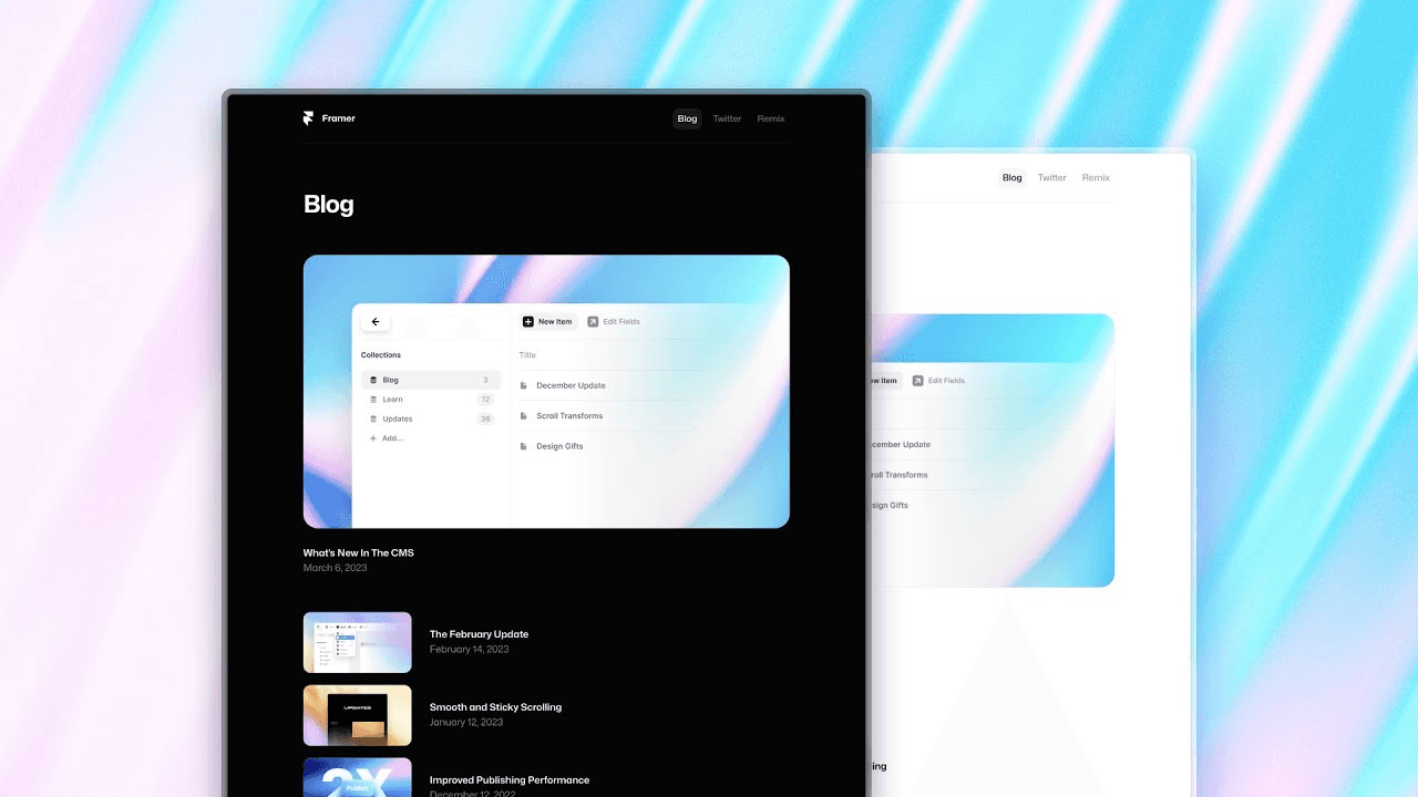
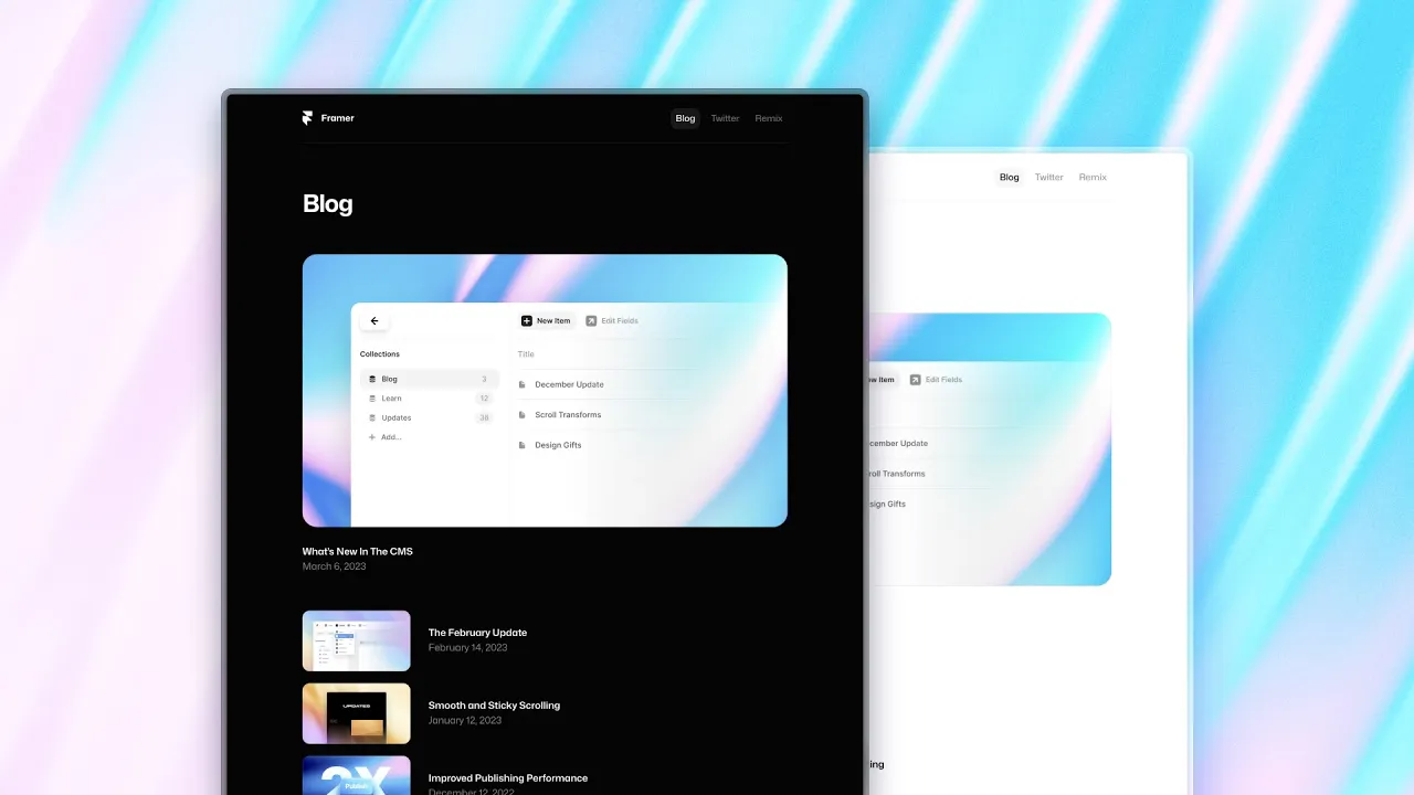
Create automatic light and dark mode in Framer with themed Color Styles. Define light and dark values once, then apply the same styles to page fills, text styles, Components, CMS pages, and animations. The published site can follow the visitor’s device appearance while the canvas lets you review both themes.
Lesson details
In this Framer tutorial, you will learn Automatic Light and Dark Mode. We explain a practical workflow, highlight the key settings that affect the result, and show how to apply the technique on real pages for cleaner UX and better site performance. See Wireframer: Dark Mode.
Frequently asked questions
How do I add dark mode in Framer?
Create Color Styles with separate light and dark values, then apply those styles to fills, text, and other supported properties. Preview both themes before publishing.
Does dark mode follow the visitor’s device setting?
Yes. The automatic theme can match the light or dark appearance selected by the visitor’s operating system or device, using the values defined in your Color Styles.
Can text styles use themed colors?
Yes. Assign a themed Color Style to a text style so headings and body text switch to the correct value with the rest of the page. This avoids maintaining duplicate text styles for each theme.
Do light and dark themes work on CMS pages?
Yes. The lesson applies themed Color Styles to both CMS index and detail pages. The CMS content stays the same while the design uses the active theme values.
Can animations use Color Styles with themes?
Yes. Elements can animate between properties that use themed Color Styles. Test both modes because contrast and motion may feel different when the color values change.
Continue watching
Load more