

A graphic design portfolio has to do two jobs at once: show the quality of the work and make the designer’s point of view easy to remember. These 12 examples use clear positioning, strong typography, thoughtful motion, and useful project context to make a portfolio feel like part of the work itself.
What these graphic design portfolios get right
Lead with a clear point of view instead of a generic job title.
Make the work easy to scan, then reward visitors who want more detail.
Use typography, color, and motion as part of the identity—not decoration added later.
Show enough process or context to explain the thinking behind the work.
Give the right client, collaborator, or recruiter an obvious next step.
12 graphic design portfolio examples
Midu Studio
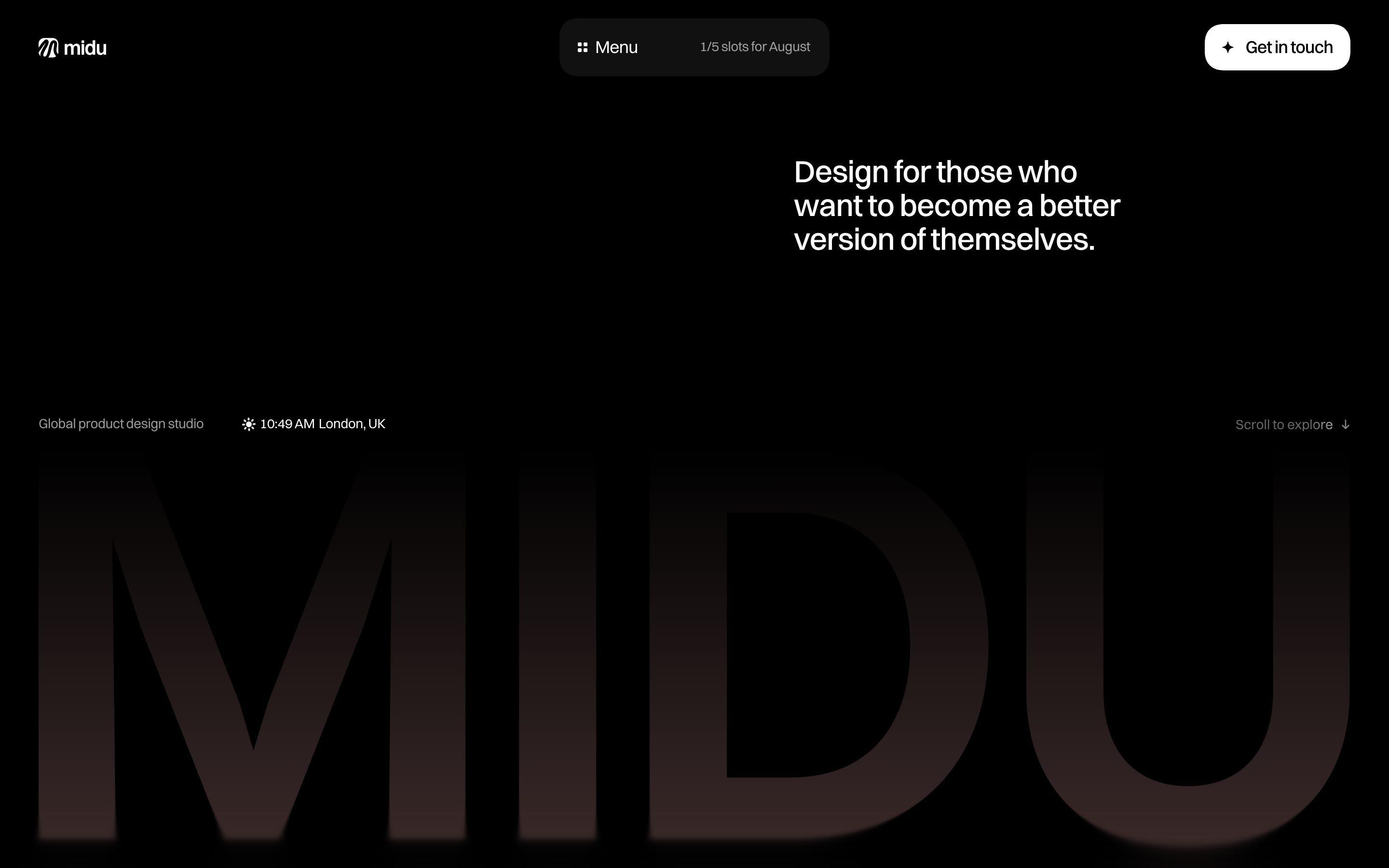
Midu Studio makes a studio portfolio feel like an experience from the first screen. The dark canvas, animated details, and video-led presentation give the studio a strong visual signature while the short positioning line explains who the work is for.
Sandra Creates
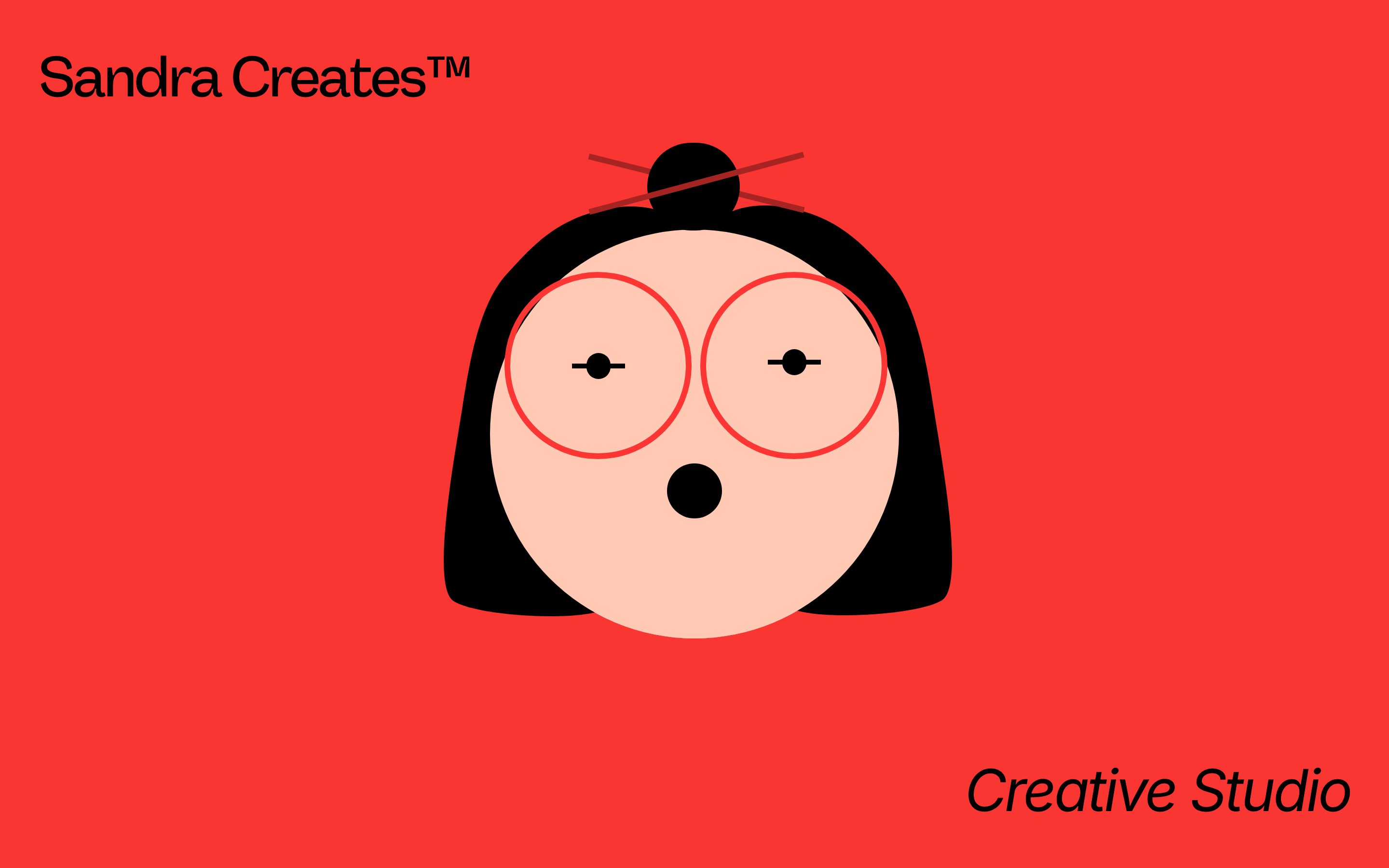
Sandra Creates puts personality before process. A bright red opening screen, illustrated character, and playful voice make the independent studio memorable before visitors reach the work, which is a useful reminder that a portfolio can demonstrate brand thinking through its own interface.
Kyne Jang

Kyne Jang shows how far restraint can go. Generous white space, an oversized serif introduction, and a short “creative digital designer” description establish hierarchy quickly and leave room for the portfolio work to carry the detail.
Xhulia Frroku
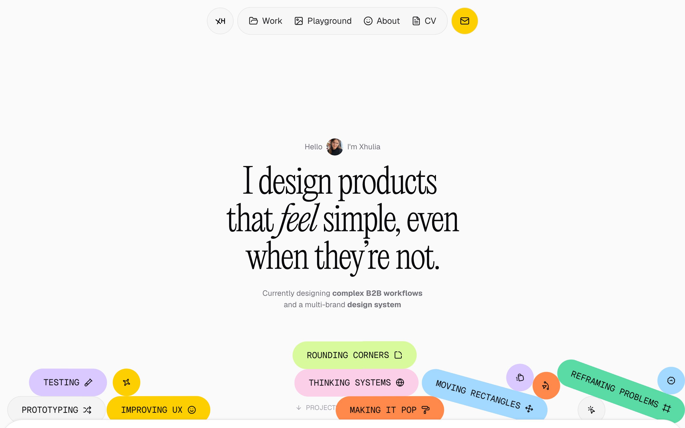
Xhulia’s portfolio explains a product designer’s approach in plain language, then uses colorful skill labels to add warmth. The result is clean and approachable without feeling anonymous: visitors understand both the discipline and the personality behind the work.
Stefan Stefancik
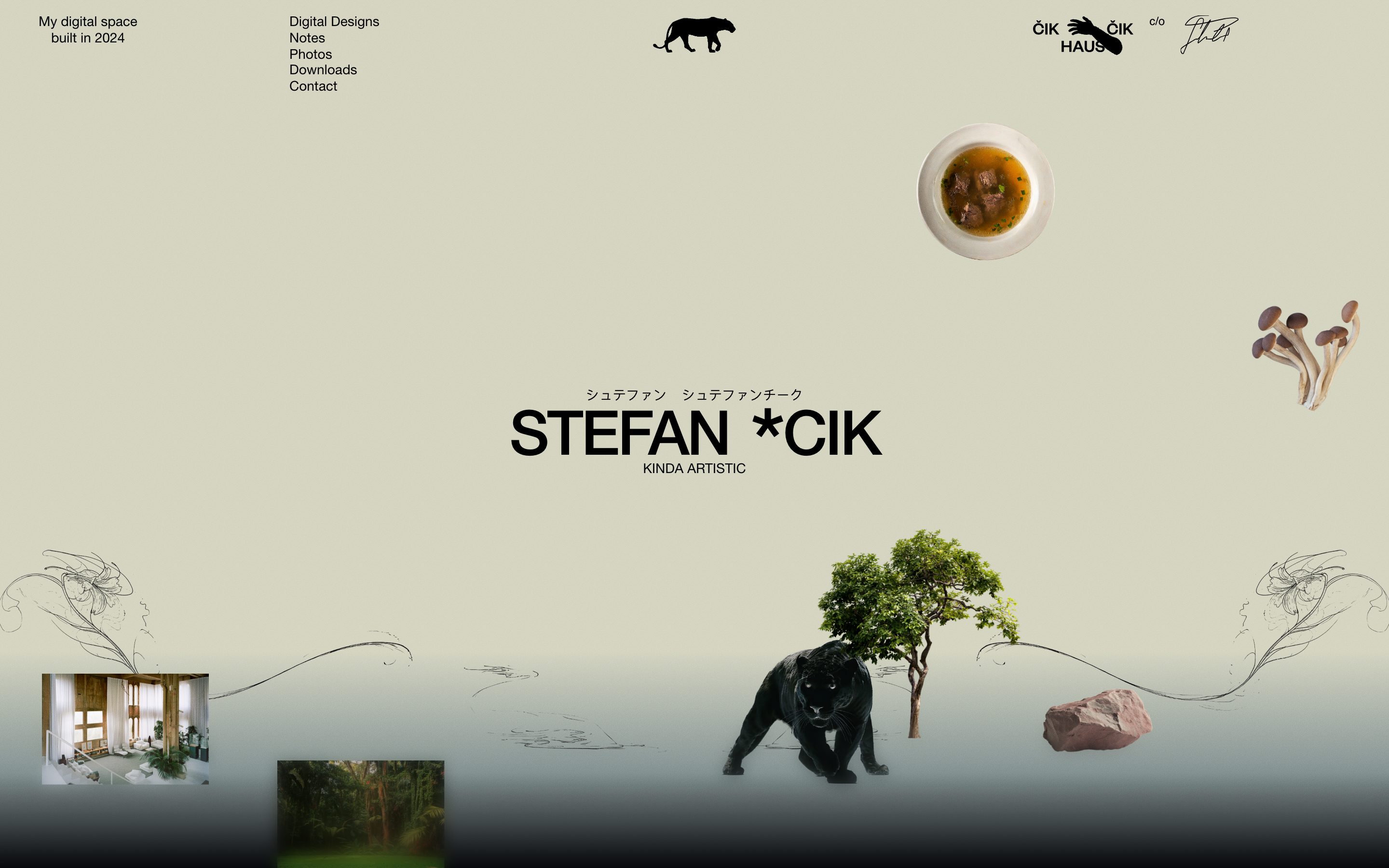
Stefan Stefancik turns the homepage into an editorial still life. Objects, images, sketches, and the “kinda artistic” line create a distinctive world around the work, showing how art direction can make even a simple portfolio introduction feel authored.
Matthew Encina
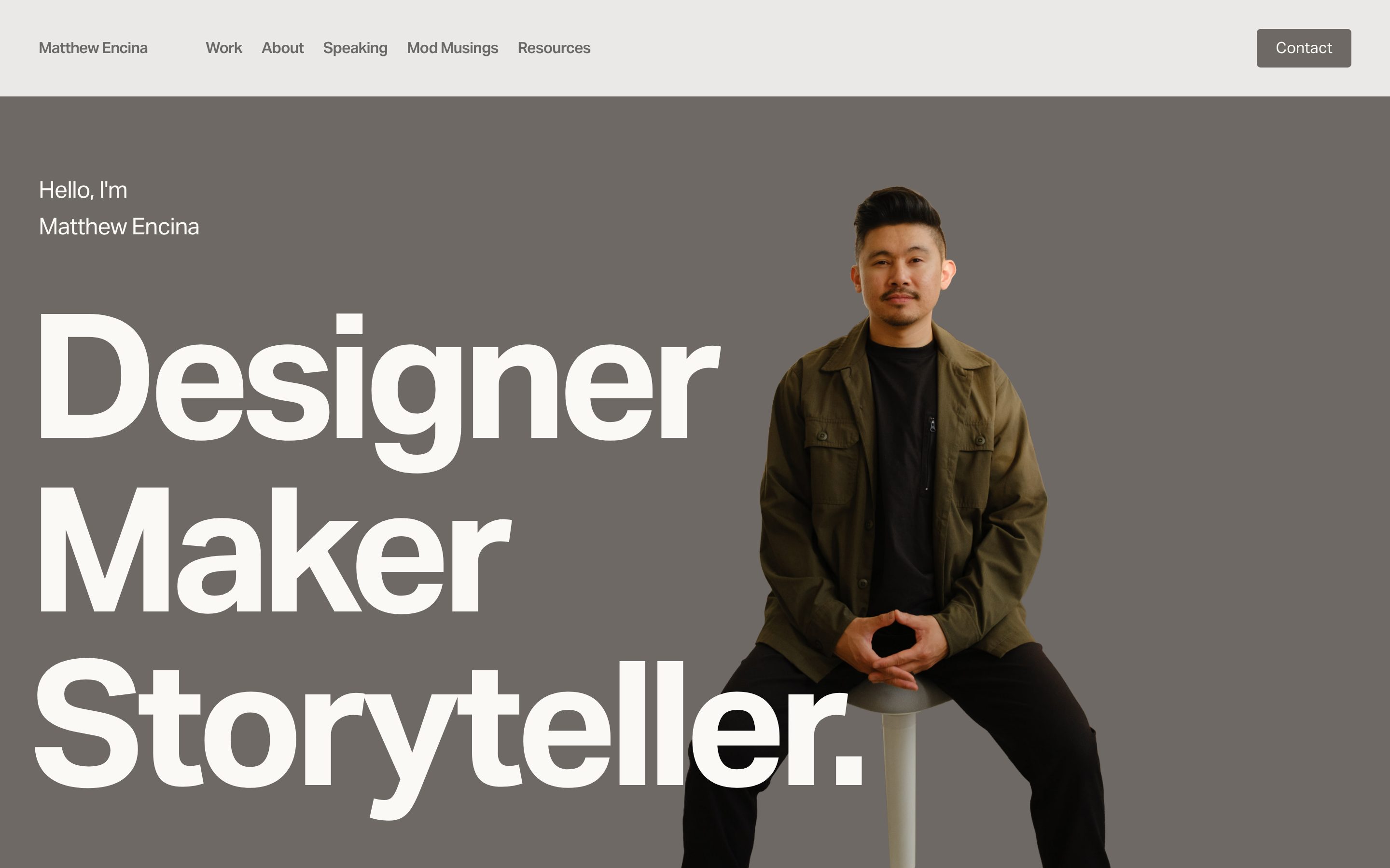
Matthew Encina gives visitors an immediate mental model: designer, maker, storyteller. The oversized words, portrait, and compact navigation work together to make his range legible without burying the page in a long introduction.
Akriti Jaiswal
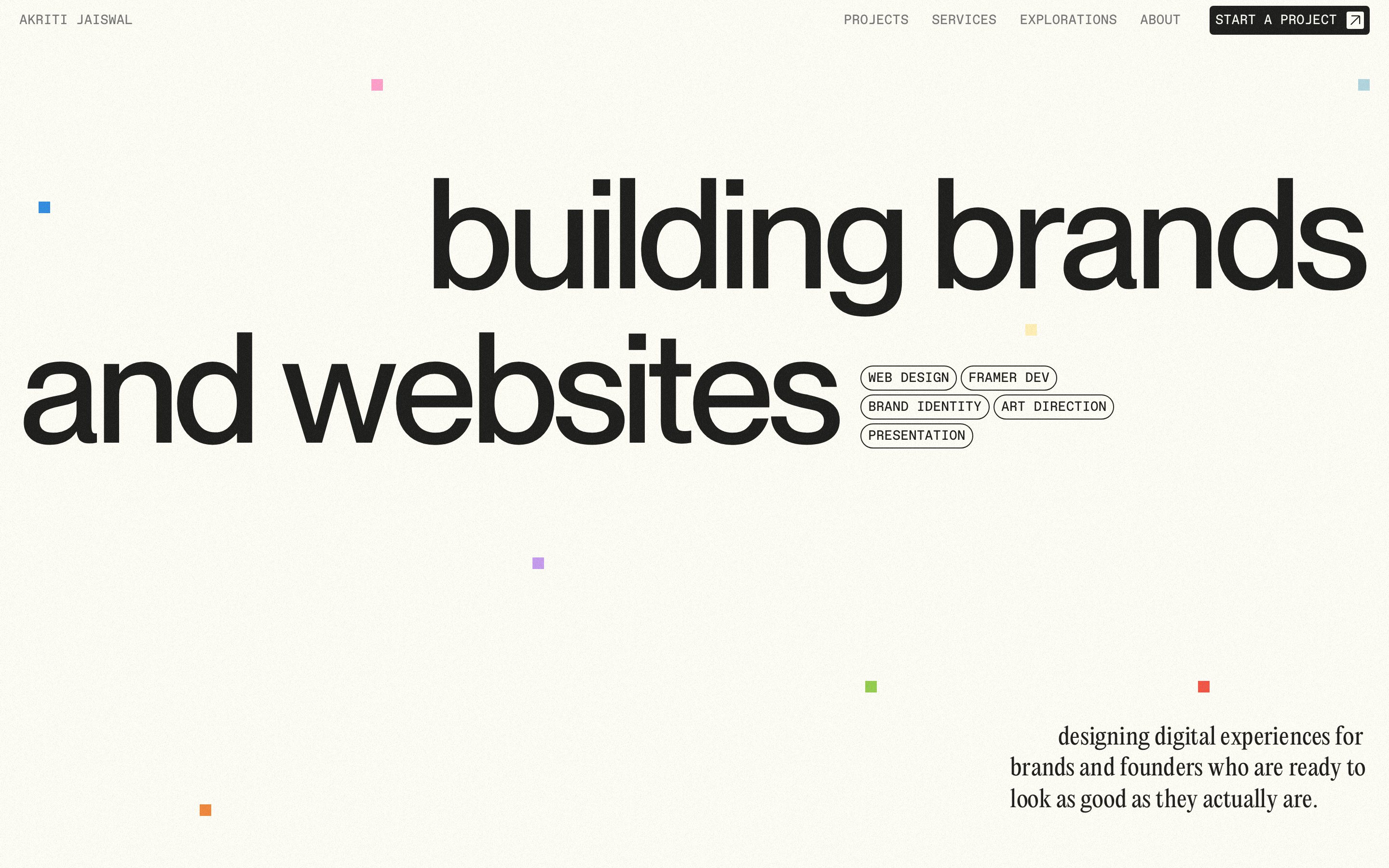
Akriti Jaiswal leads with the outcome—“building brands and websites”—rather than a list of software or services. The huge type, small color blocks, and compact service labels create a flexible identity that feels equally suited to brand work and digital experiences.
Syd
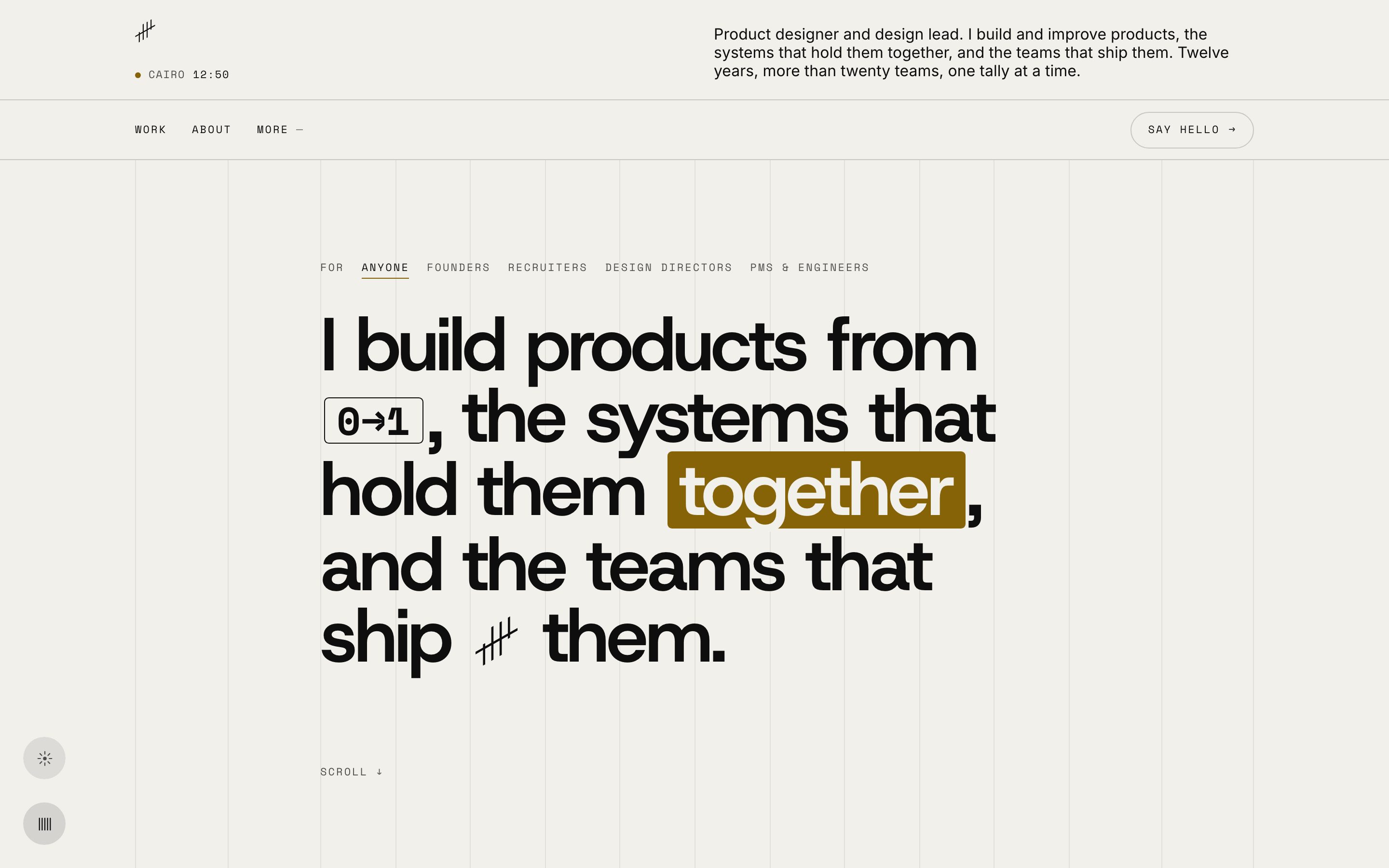
Syd’s portfolio uses a quiet grid and a single warm accent to make a product-design practice feel systematic. The concise introduction names the work, the systems behind it, and the teams involved, giving potential collaborators useful context before they browse the projects.
RabenRifaie

RabenRifaie uses a deliberately sparse opening to create anticipation. The restrained wordmark and dark visual field set up a studio focused on branding, immersive web, and 3D motion, proving that a portfolio does not need to show every project in the first viewport.
Pradnya Dighe
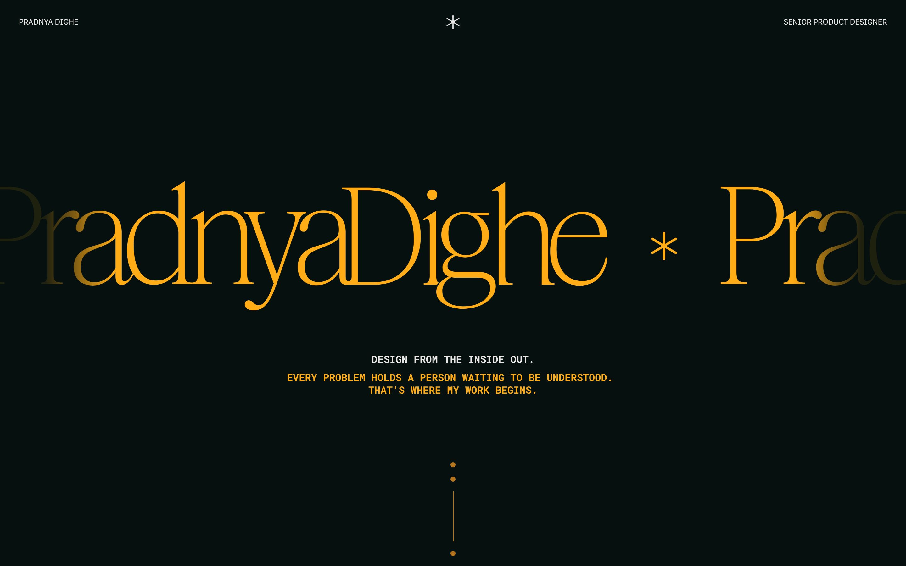
Pradnya Dighe combines a large typographic name with a clear role and a short design philosophy. The dark palette and amber serif lettering make the page feel editorial, while the “design from the inside out” message gives the case studies a point of view to build on.
Teona Kokhodze
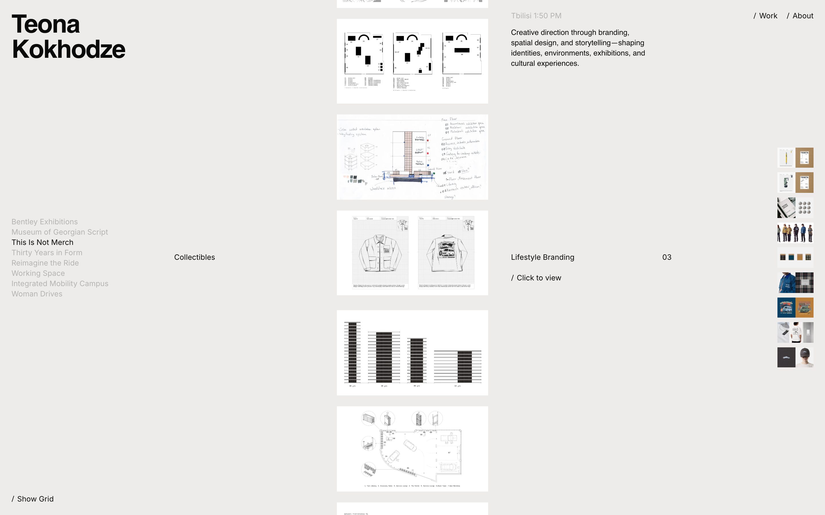
Teona Kokhodze treats the portfolio like an index of ideas. A project list, central case-study imagery, and a description spanning branding, spatial design, and storytelling let visitors understand the range without losing the thread between projects.
Gustavo H
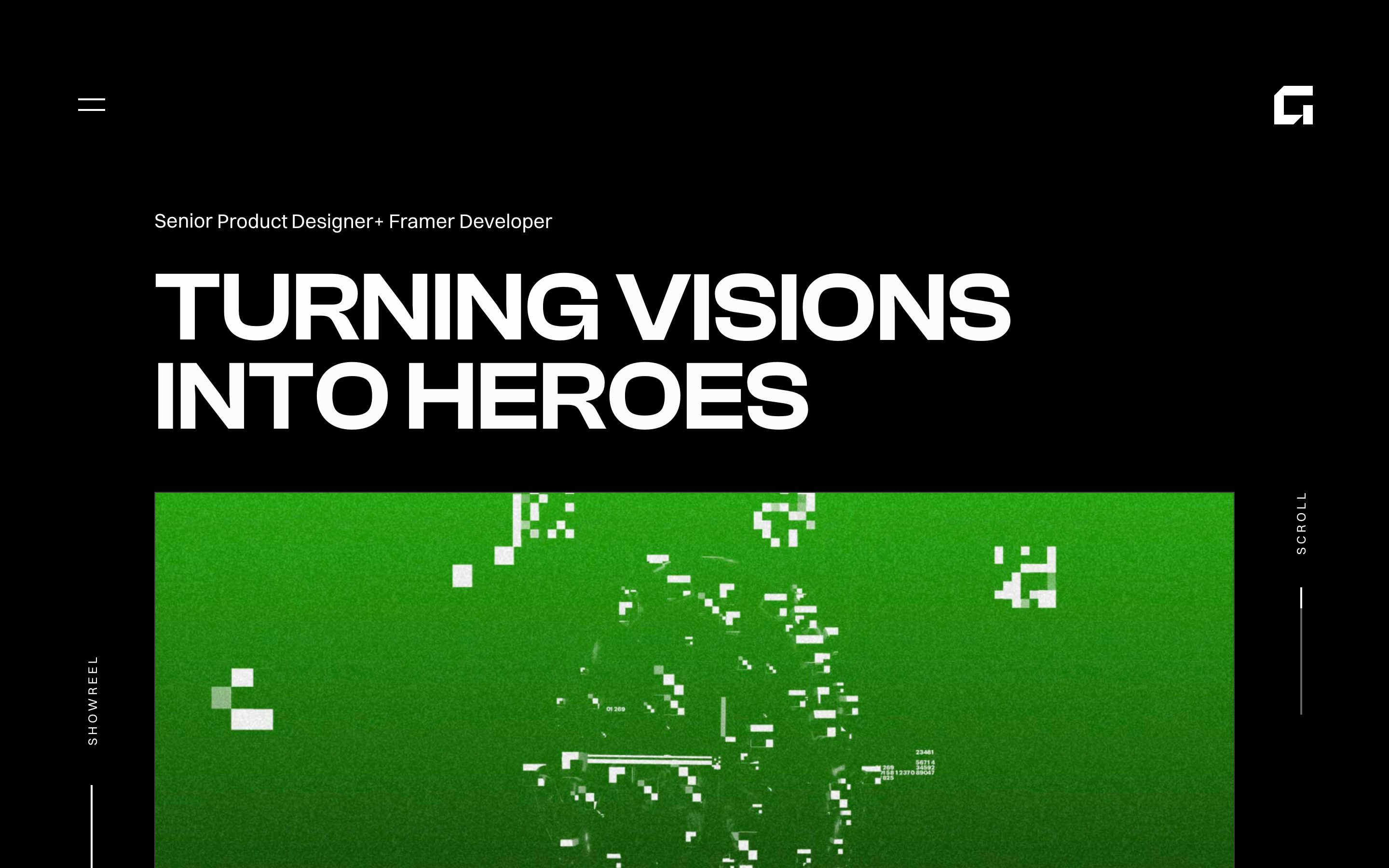
Gustavo H opens with a strong promise—turning visions into heroes—and immediately follows it with a vivid work preview. The contrast-heavy layout shows how a portfolio can use motion, color, and a direct headline to make a senior designer’s role feel memorable.
Browse more live work in Framer’s Portfolio Gallery.
